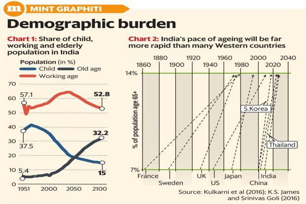
1.While India’s overall population would grow for another 20-30 years, much of the growth would happen in poorer states, resulting in a huge spike in internal migration. Kerala or Tamil Nadu are far closer to Western Europe in terms of the fertility rate, and the Gangetic belt closer to Africa. A tiff similar to the ongoing international backlash against migration may play out within India
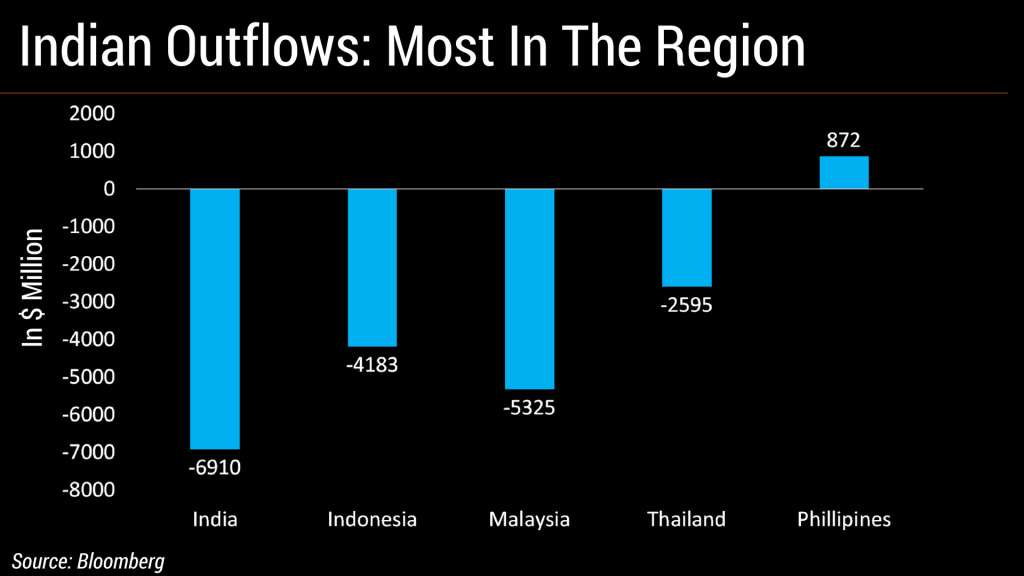
2.India has seen the highest foreign fund outflows among its emerging south and southeast Asian peers so far this year as the rupee depreciates and global trade tensions escalate.Equity market is holding up purely on SIP flows whereas bond yields are bearing the brunt of added outflows from domestic investors
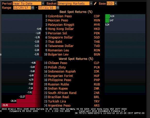
3.The Foreign outflows can also be seen from the lens of currency depreciation. All countries which have seen significant depreciation have seen worsening macros or political instability
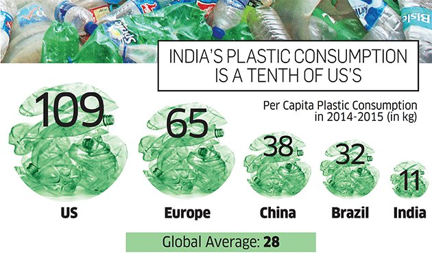
4.Lot of debate on plastic consumption in India, but our consumption is barely 1/10 that of US .
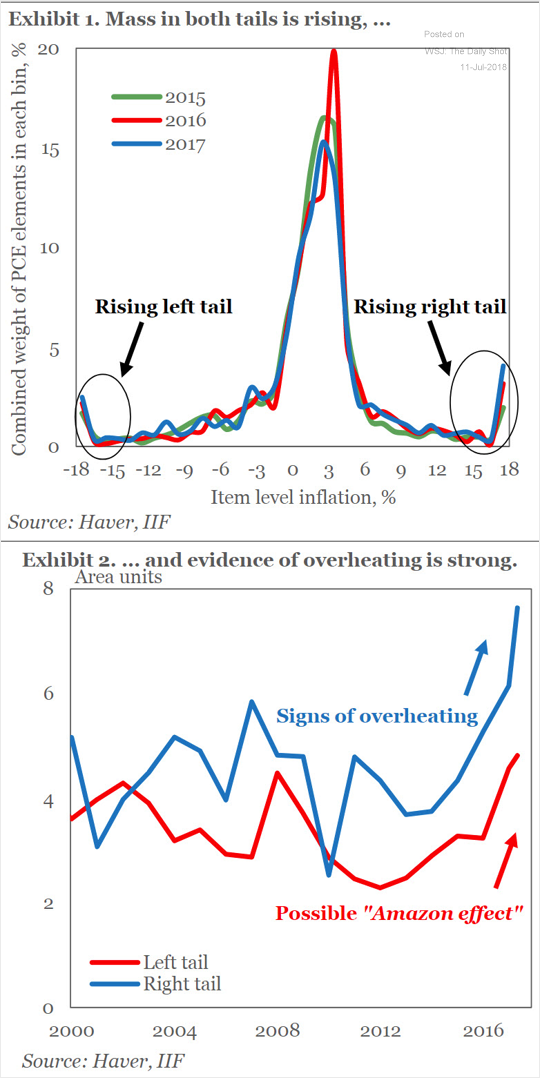
5.Amazon effect on inflation fading as overheating concerns start cropping up.
Below is a chart of US consumer inflation distribution by item. Both “tails” are on the rise. IIF attributes the lower tail to the “Amazon effect.” The upper tail, however, shows “signs of overheating.”
This can be a significant driver of Global inflation
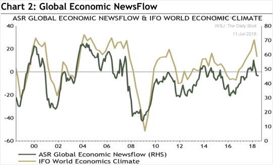
6.But the below proprietary chart from Absolute strategy research on Economic news flow points to a coming global slowdown.If I combine global slowdown with inflation concerns then it points to STAGFLATION
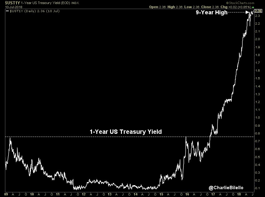
7.The US 1 year yield is at a 9 year high making , highest in the developed world increasing the allure of USD
July ’09: 0.45%,July ’10: 0.30%,July ’11: 0.17%,July ’12: 0.20%,July ’13: 0.13%,July ’14: 0.11%,July ’15: 0.28%
July ’16: 0.50%,July 17: 1.20%
Today: 2.36%