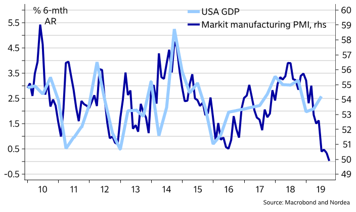
If Donald Trump’s aides and advisors are looking for signs that the US economy is about to roll over ahead of an election year, they can take a gander at the flash read on IHS Markit’s factory gauge.
Unfortunately, it sank into contraction territory for the first time in nearly a decade, printing 49.9, down from 50.4 in July and 54.7 a year ago.
It was the lowest read since September 2009.
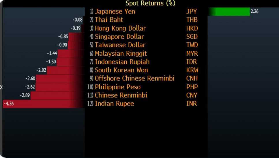
Move on CNY…..Rupee is the worst performer MTD
Asian Month to date FX spot
Tom Mccllelan writes “The chart below shows the relative strength ratio for the Russell 2000 Index versus the Russell 1000. Also in the chart is the spread between the 10-year T-Note yield and the 3-month T-Bill yield, which is one of the common ways of showing the “yield curve”. The trick in this chart is that the yield spread’s plot is shifted forward by 15 months in order to show how the R2/R1 relative strength ratio tends to follow in the same footsteps after that lag time. This is relevant now because the R2/R1 relative strength line has been moving lower, indicating that small cap stocks have been underperforming large ones on a relative basis. And the continued drop in the 10-3 spread says that this underperformance of the small caps is likely to continue for the next 15 months.

Junk bond spread to the broader index are blowing out to highest level since 2016. Via @lisaabramowicz1
