October 17, 2019
Dear Investors:
Outlook for US Stocks and the Economy
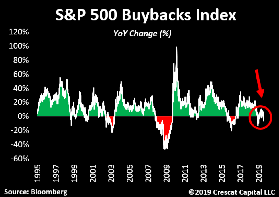
A breadth of deteriorating indicators is signaling an inflection point for the US stock market and economy. The percentage of inversions in the US yield curve surged to over 70% last month. This level of upside-down term premium has always led to severe bear markets and recessions in the past. Also, another major source of liquidity for stocks has just now started to fail. The S&P 500 Buybacks Index is now down on a year-over-year basis meaning that the companies with the most aggressive buybacks are no longer seeing an increase in their stock prices. Companies at large continue to repurchase shares, but the total level of buybacks is also off its record highs from a year ago.
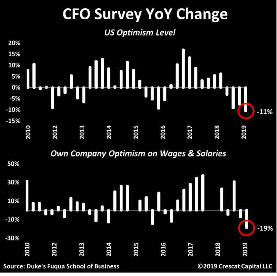
In the last several weeks, we have seen dismal economic indicators on multiple fronts: CEO confidence falling the most since the Global Financial Crisis, ISM figures plunging, and company insiders selling the most in two decades. Now the CFO survey is providing further evidence that the expansion is no longer alive and well. In the history of the survey, these sober-minded capital allocators have never shown a bigger decline in optimism. These are the men and women making corporate borrowing, spending, and hiring decisions.
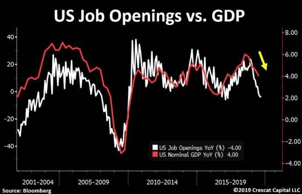
We have shown that US stocks have reached historic high levels across a composite of valuation measures. With earnings fundamentals and economic indicators faltering, a bear market and recession is almost certainly around the corner. Now, the labor market is also showing signs of weakness. Jobs openings just fell by 4% on a year over year basis. This leading indicator is strongly correlated with the overall business cycle and suggests a significant deceleration in nominal GDP in Q3 that would leave zero real growth for the quarter after inflation.
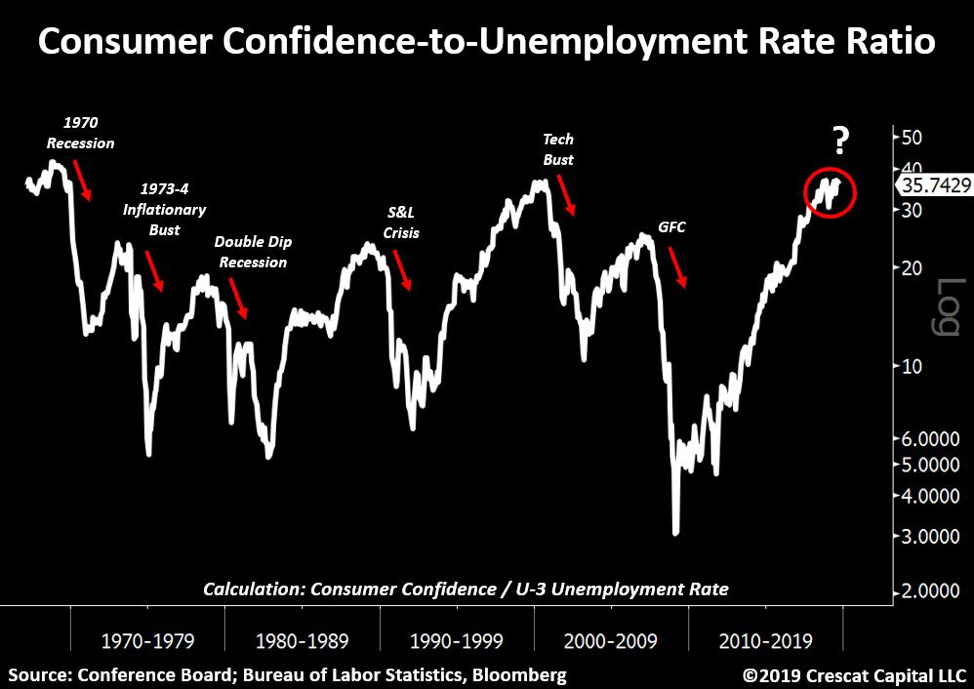
We continue to believe the economy is painted into a corner. A case in point is two reliable contrarian indicators that are now at an extreme. Consumer confidence is near all-time highs while unemployment rate is at a 50-year low. When you look at the ratio of these two measures, we are now re-testing the levels that preceded both the 1970 recession and the tech bust.
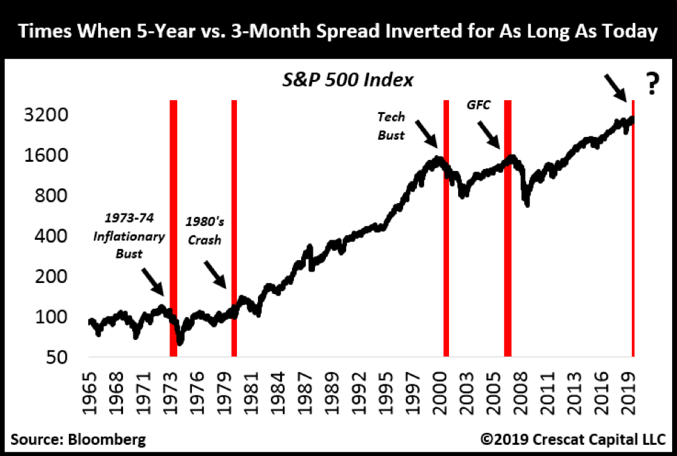
Yield curve inversions continue to be a major reason the recession clock is ticking faster. On that front, it’s important to note that 5-year vs. 3-month US Treasury spread has been inverted for 8 months. This only happened 4 other times in history: at the peak of the housing bubble, during the tech and 1973-4 inflationary bust, and 5 months prior to the 1980 recession.
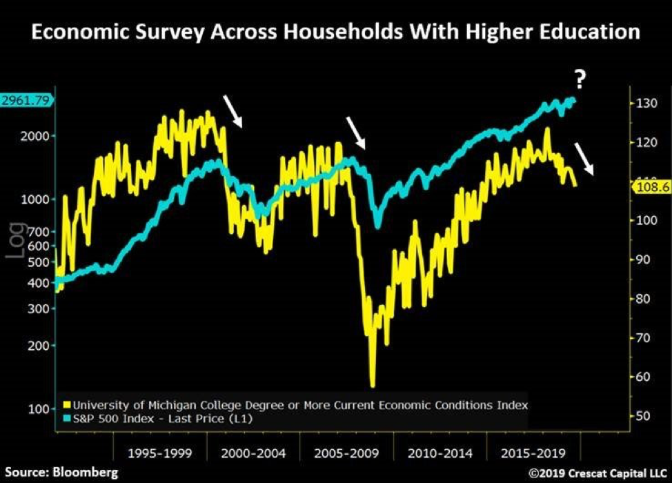
The University of Michigan performs a monthly survey across households with higher education in the US. This indicator just started to tip over, and it has also been highly correlated with the changes in the business cycle.
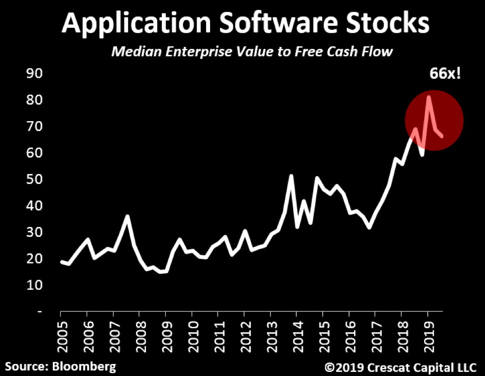
When searching for cracks in the market, look no further than its leaders. FANG stocks are the first ones to come to mind. Aside from Google, Netflix is down 30% from its previous highs, Facebook close to -15%, and Amazon about -13%. These are all staggering declines when compared to Nasdaq still 2 percentage points away record levels. Software stocks are showing a similar divergence. However, it’s the valuation of these businesses that continues to be a problem. Today, software stocks, thanks the popular and now ubiquitous software-as-a-service (SaaS) business model, trade at an absurd 66x median EV to free cash flow. It was 80x just three months ago! We have been short about a dozen of the highest of these high-flyers in our hedge funds since late June. The group seems to have peaked in late July and has continued to deliver gains for us even as the S&P 500 trended higher in the last month and a half.
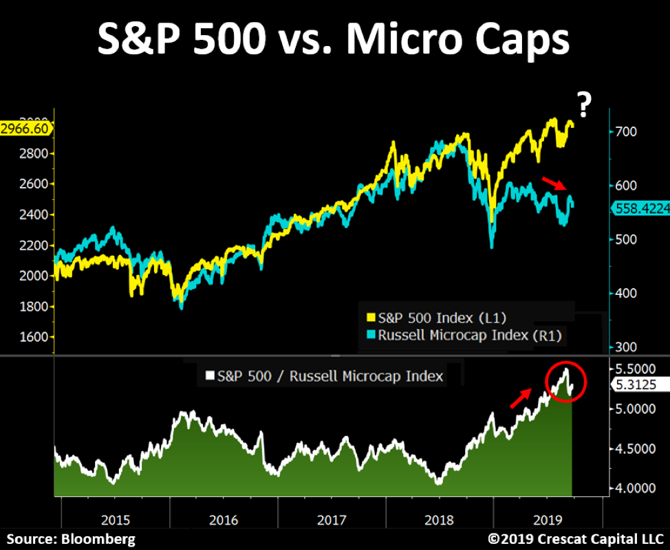
Faltering leadership is also present on a sector level. Industrials, financials, health care, energy, and materials have all peaked a long time ago. These are all major parts of the economy and represent a major sign of stress in the market. Microcap stocks’ underperformance relative to the large cap market is yet another bearish divergence. These smaller companies are now down close to 20% since September of 2018. They tend to be domestic-oriented businesses that have correlated strongly with the overall market throughout history. The S&P 500 looks like it is poised to play catch-up.
Leveraged loans also portend problems for equity markets. These murky corporate debt instruments are now revealing a key risk for the US economy. This $1.5 trillion market has more than doubled since the Global Financial Crisis. The price of leveraged loans is now significantly diverging from the S&P 500, another likely leading indicator for stocks.
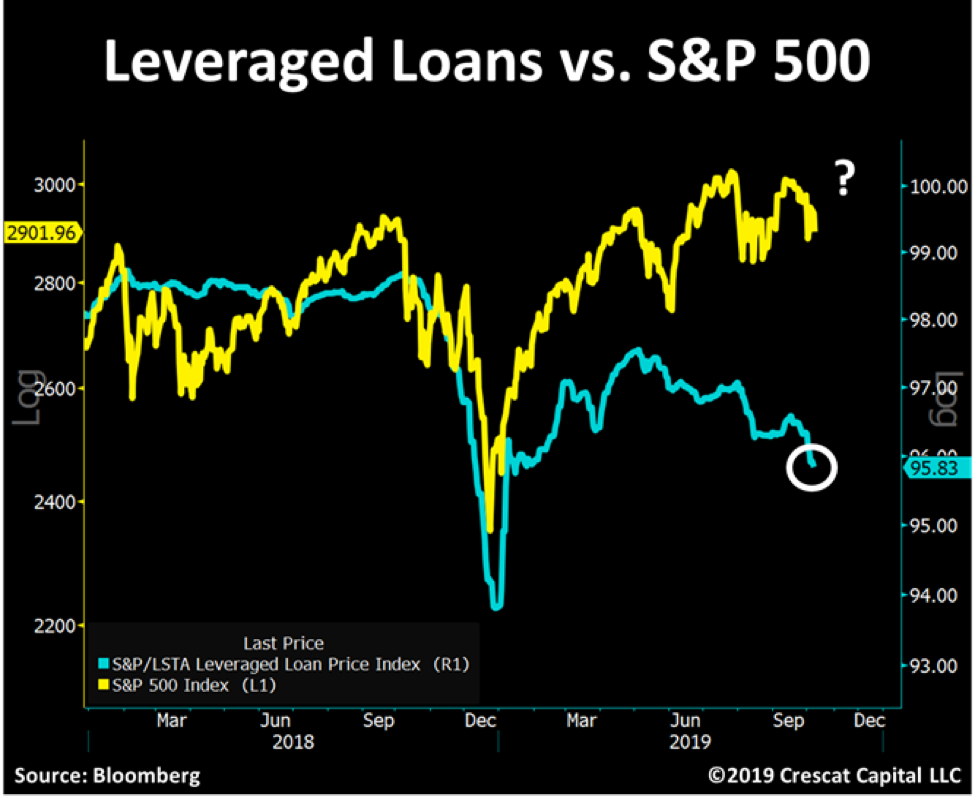
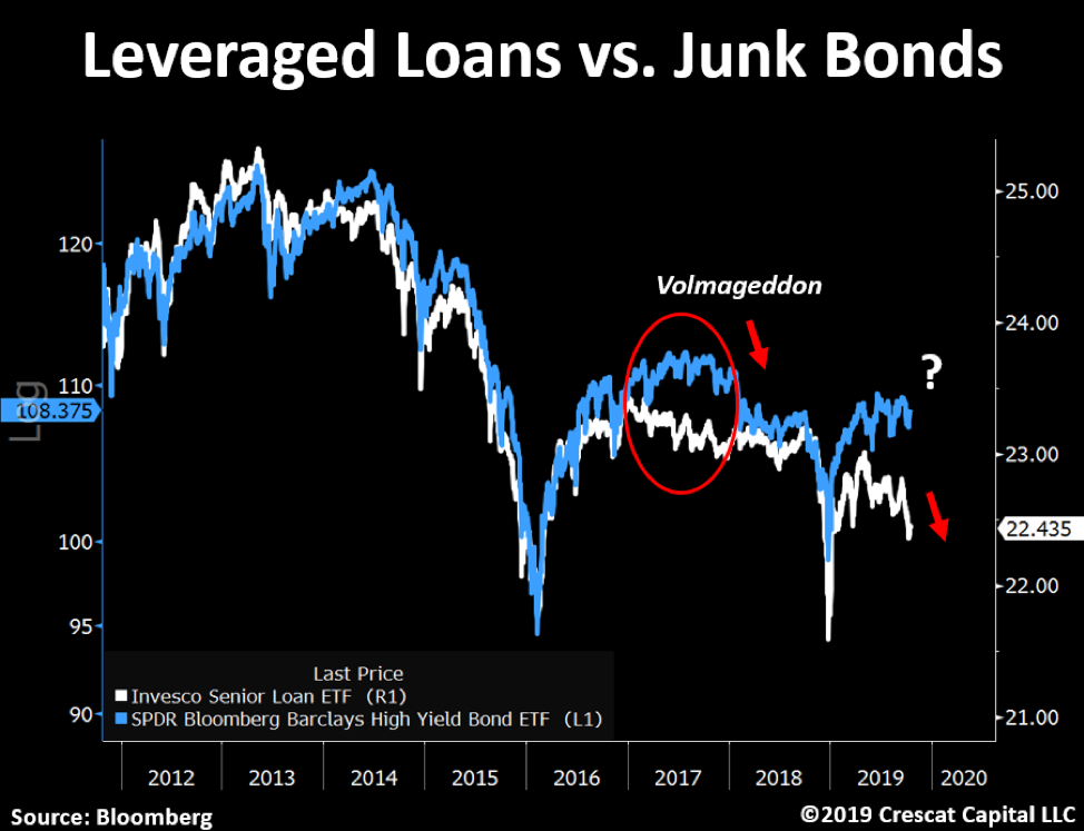
Leveraged loans and high yield bonds are also diverging. Last time this happened it preceded Volmageddon in early 2018. In our view, given this record long economic expansion and historically elevated corporate debt levels, junk bonds look extremely vulnerable for the following months.
China and Hong Kong
But leverage is not just problem in the US corporate market today. When we look globally, China today is arguably the biggest total-country credit bubble in world history. They have grown their entire banking system assets by over 400% since the GFC to about 40 trillion USD equivalent. That’s 2.3 times bigger than the US banking system for a GDP economy that is 36% smaller. ($21.3T vs. $13.6T). Add to that, that China is a totalitarian, communist emerging market with all its attendant corruption and mismanagement. In our view, China has an enormous hidden non-performing loan problem and is facing severe capital outflow pressure.
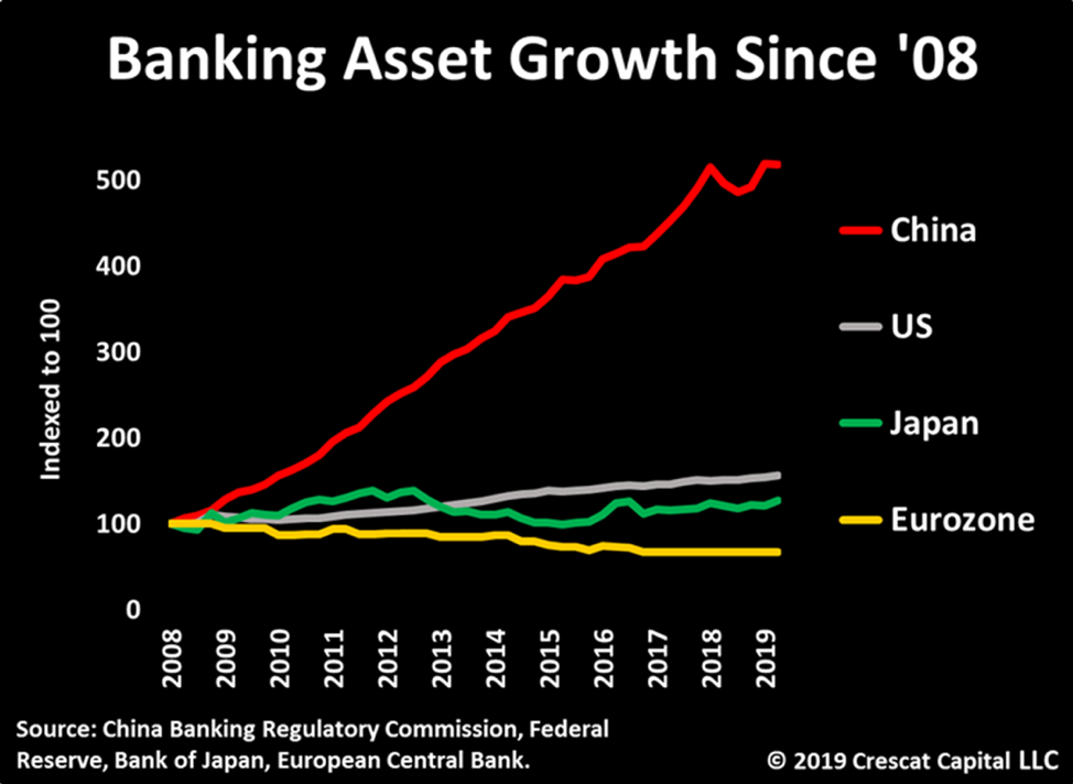
Credit bubbles build up when private sector debt growth rapidly outpaces GDP growth. Some of the world’s biggest financial crises have followed from this unsustainable pattern: Japan post 1989; S. Korea, Thailand, Indonesia gave us the Asian Currency Crisis in 1997; Housing bubbles in the US and Europe built up until 2007 leading to the Global Financial Crisis in 2008. Some of the larger countries facing financial risks today based on this pattern are China, Canada, and Australia. Canada and Australia have their own banking and housing bubbles related in no small part to at least a decade of illicit Chinese capital outflows that should soon be drying up completely.

The build-up in Hong Kong’s debt to GDP is off the charts compared to those other credit bubbles at almost 300% for combined household and corporate non-financial debt.
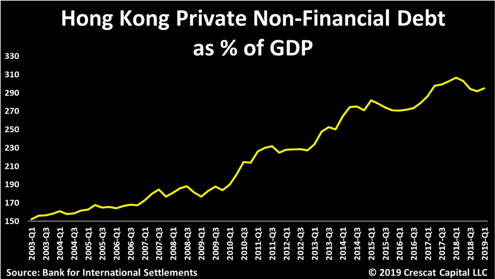
Hong Kong is a Special Administration Region of China. Still, it retains its own currency, the Hong Kong dollar, a throwback to 156 years of British rule prior to the handover to China in 1997. As part of reunification with China, Hong Kong was supposed to retain its own democratic system of government and its own economic systems, but increasingly Hong Kong been coming under Beijing’s totalitarian control. The people of Hong Kong are rebelling. In the past several months, ongoing civil protests against the Chinese Communist Party have risen to a level comparable to 1989 Tiananmen Square democracy demonstrations. Hong Kong’s excessive debt growth relative to its underlying economy and its attendant record setting property bubble are warning signals of an impending financial crisis. We believe the Hong Kong dollar is likely to de-peg from the US dollar given capital flight from this former offshore banking haven.
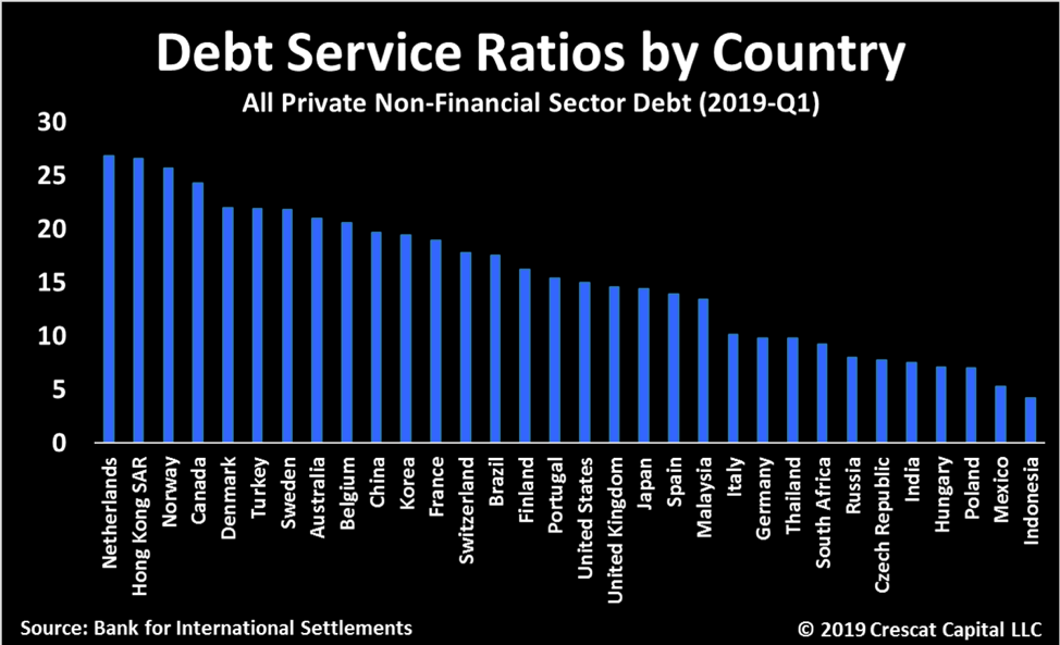
Hong Kong’s debt service ratio has been steadily rising and is now at 27%. The DSR is the percentage of annual income that Hong Kong’s citizens and businesses need to service their debts. Hong Kong has one of the highest DSRs among all the countries tracked by the tracked by the BIS, another financial crisis warning signal.
Outlook for Precious Metals
Aggressive monetary policies late in the business cycle are yet another warning sign of economic problems. It’s not just the Fed, global central banks are now hamstrung in the face of record financial asset bubbles and record low inflation expectations. Rate cuts, QE, other forms of liquidity injections should all result in a major shift in the macro landscape toward currency wars, rising inflation expectations, and bursting asset bubbles. Combine that with a grab for safe-haven assets that cannot be diluted by monetary debasement. Such a shifting macro landscape is one where gold can quickly become king.
In a world of yields near record lows, we find it interesting that many are still oblivious to the fact that US core CPI just hit a decade high. Meanwhile, the US 10-year yield vs. core CPI is at a 40-year low.
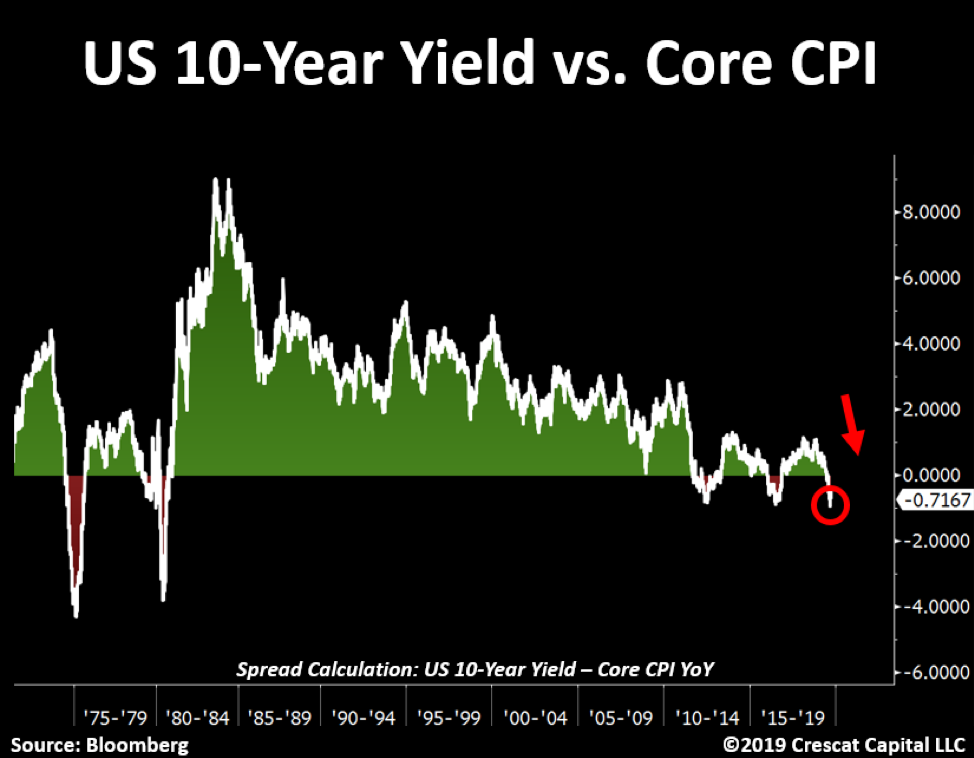
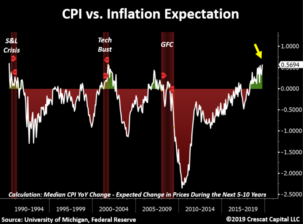
Inflation tends to surprise investors at the top of the business cycle. The outlook for rising prices is near 40-year lows while median & core CPI are at decade highs. While we are concerned about the deflationary impact of financial asset bubbles bursting including a credit bust in China, at the same time, we believe that inflation is one of the most underrated risks out there.
Ultimately, inflation is a monetary phenomenon. Since 2005, the global fiat central bank monetary base (M0) in USD terms has grown at a compound annual rate of 11.6% and is valued at $20.5 trillion today. Over time, we believe the price of gold tracks the amount of central bank money printing or global M0 growth converted to dollars. This relationship worked very well from 2005 until 2012 as we show in the chart below. But beginning in 2013, the price of gold started diverging from global printed money. As a result, we believe that gold is undervalued today.
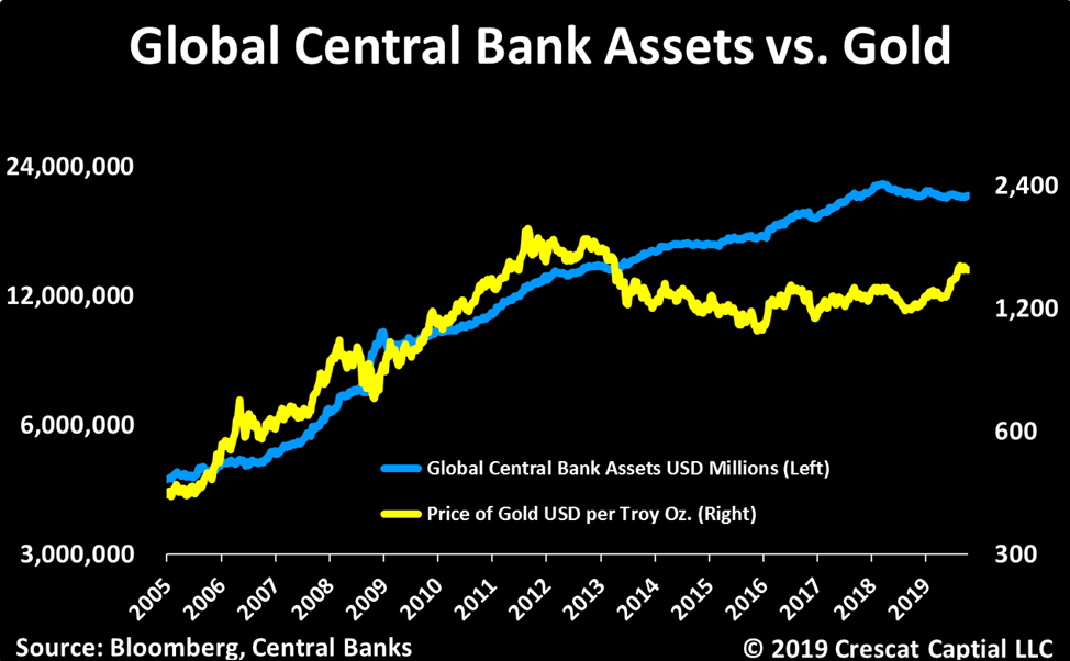
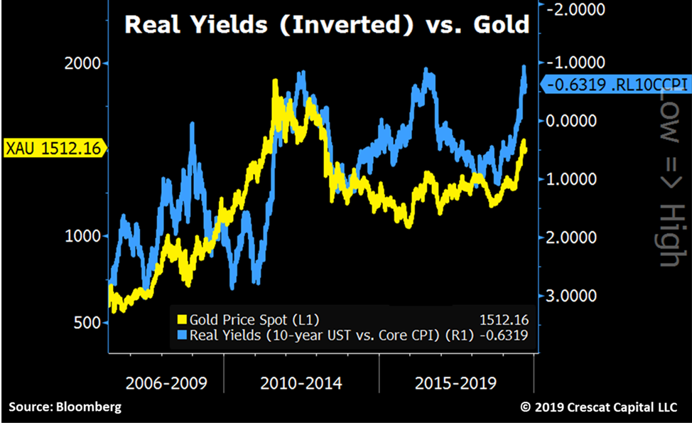
The reason for the divergence in the price of gold was that the money printing failed to materialize into the much-anticipated inflation spike in the aftermath of the GFC. In hindsight, the money printing largely went to re-inflating financial asset prices (debt and equity markets) rather than driving consumer price inflation. So, gold prices followed the path of declining inflation expectations. Said another way, the price of gold moved inversely to rising real interest rates. Below we can see the correlation between gold and inverted real interest rates based on the 5-year TIPS yield. Recently, real yields have started declining again, breaking out on the inverted chart from a 6-year downtrend. Real yields are not declining because inflation expectations are picking up, rather solely because nominal rates have come down. Just think how much gold could rise if inflation expectations also start to pick up. In this chart, we can clearly see that declining real yields have been a significant driver for gold’s recent move up!

If we use core CPI which actually is rising for real yields instead of expected inflation embedded in the TIPS yield, then we can see that gold may still have lot more catching up to do on the upside. This view jibes with our Central Bank Assets vs. Gold chart further above. Core CPI is more volatile than TIPS implied inflation but could be a good lead indicator in the current cycle.
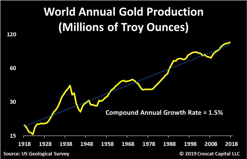
In contrast to fiat money’s 11.6% growth rate over the last decade and a half, the global supply of gold grows at a much more constrained long-term rate of about 1.5% annually. For this reason, gold has served as a sovereign and central bank reserve currency for thousands of years. The characteristics that have made gold the ultimate monetary asset are durability, portability, divisibility, uniformity, limited supply, and acceptability.
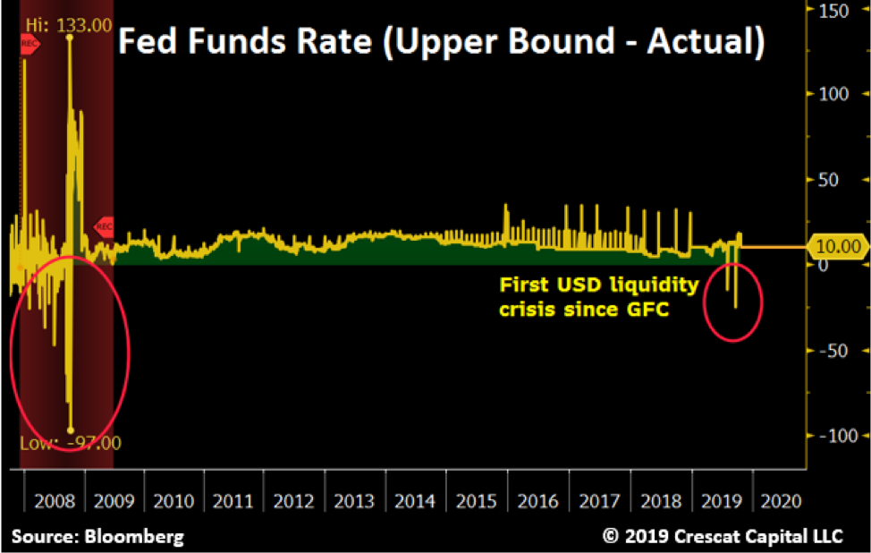
So, you have probably heard about the recent money market liquidity crisis where overnight repo rates rose as high as 10% in September. This dysfunction bled through to the fed funds market where the Fed’s benchmark rate breached the upper bound for the second time in the last three months. Such a breach is an important signal since it has not happened since the global financial crisis.
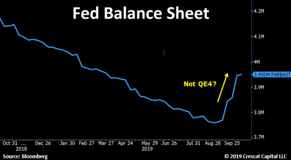
The breach was indeed a liquidity crunch as the Fed has now admitted that it took its quantitative tightening too far. Tight cash supplies in September were diverted to fill US government coffers through new Treasury issuance and corporate taxes. Banks failed to step up and fill the liquidity gap, so Fed was forced to step in with emergency cash, aka money printing, but don’t call it QE. The Fed has added $180 billion to its balance sheet in just one month since the repo liquidity crisis started. Chairman Jay Powell says, “In no sense is this QE!” Whatever you call it, it sure looks like money printing to us.
Fed intervention is clearly needed to stem the liquidity crisis and help prevent collapsing financial asset prices. However, the question is, will investors respond to new central bank easing by bidding up risk-on assets again? Or could ongoing new monetary stimulus also serve to create real-world inflation as in other macro cycles such as in the 1970s? Investor and consumer psychology and behavior need to be monitored as they will play a key role. The fact is, rising inflation expectations are a self-fulfilling driver of inflation. The post GFC world had the benefit of declining such expectations. That could happen again, but we seem to have the opposite setup today. This is particularly troublesome for stock and bond bulls because rising inflation would almost certainly be a killer of today’s financial asset price bubbles. The crowded risk parity trade (long stocks + leveraged long bonds) can handle deflation very well but not inflation. If one is going to buy stocks at all in this environment, one area that looks extremely attractive with low valuations and improving fundamentals is gold and silver mining stocks.
