Russell Clark of Horseman Capital writes
1st Half (2000-2010)– Reflation trade
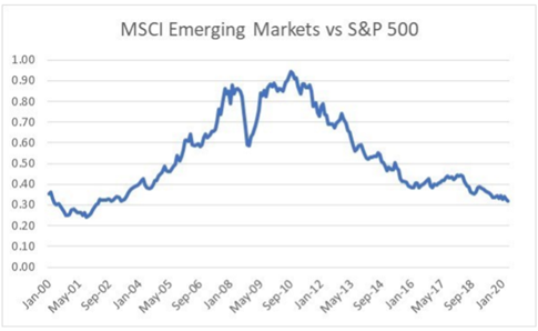
From a purely macro perspective, the emerging market and reflation story of the 2000s was a reflection of the exciting macro story of that period, the rapid growth of Chinese exports
– Rising commodity prices, Weak Dollar, Strong growth
2nd Half (2010-2020)– Deflation trade
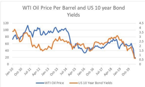
The macro story of 2010s has been the tremendous growth in US oil and gas production, to make the US the world’s largest energy producer, and to turn the US from an energy importer to exporter.
Falling commodity prices, Strong Dollar, Weak growth
The tune – Core periphery model– Let me explain the components of this model
Core = US Dollar
Periphery = Rest of the world
1st half money moves away from core fueling rally in Periphery (emerging markets)
2nd half …The combination of slower Chinese growth, rapid oil production growth led to a collapse in oil prices, contributing to suppressed inflationary pressures, and this has precipitated a collapse in bond yields as central banks have desperately tried to reignite growth.
Rise in oil supply by shale + existing suppliers
Led to Deflation
Which led to
which further led to
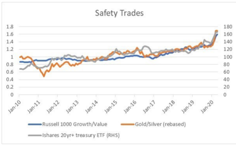
Safety trades comprising of high tilt towards growth stocks + gold + long dated bonds
So what do we see happening
Many of these trends will reverse
Well the US shale boom seems to be ending which means us will be a net importer again and restart dollar weakening cycle.
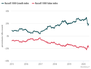
With an uptrend of regulation moving towards the growth sector comprising highly of tech sector and a wave of regulatory green shoots regarding free riding of media platforms on free content we see entry of regulation as a reversal of the growth stock trend. The other parallel is like the dotcom bubble we live in the offload risk on to others platforms and a bubble based on Machine learning.
All this money from growth stocks will mean revert to Value stocks which have underperformed growth for better part of the last decade
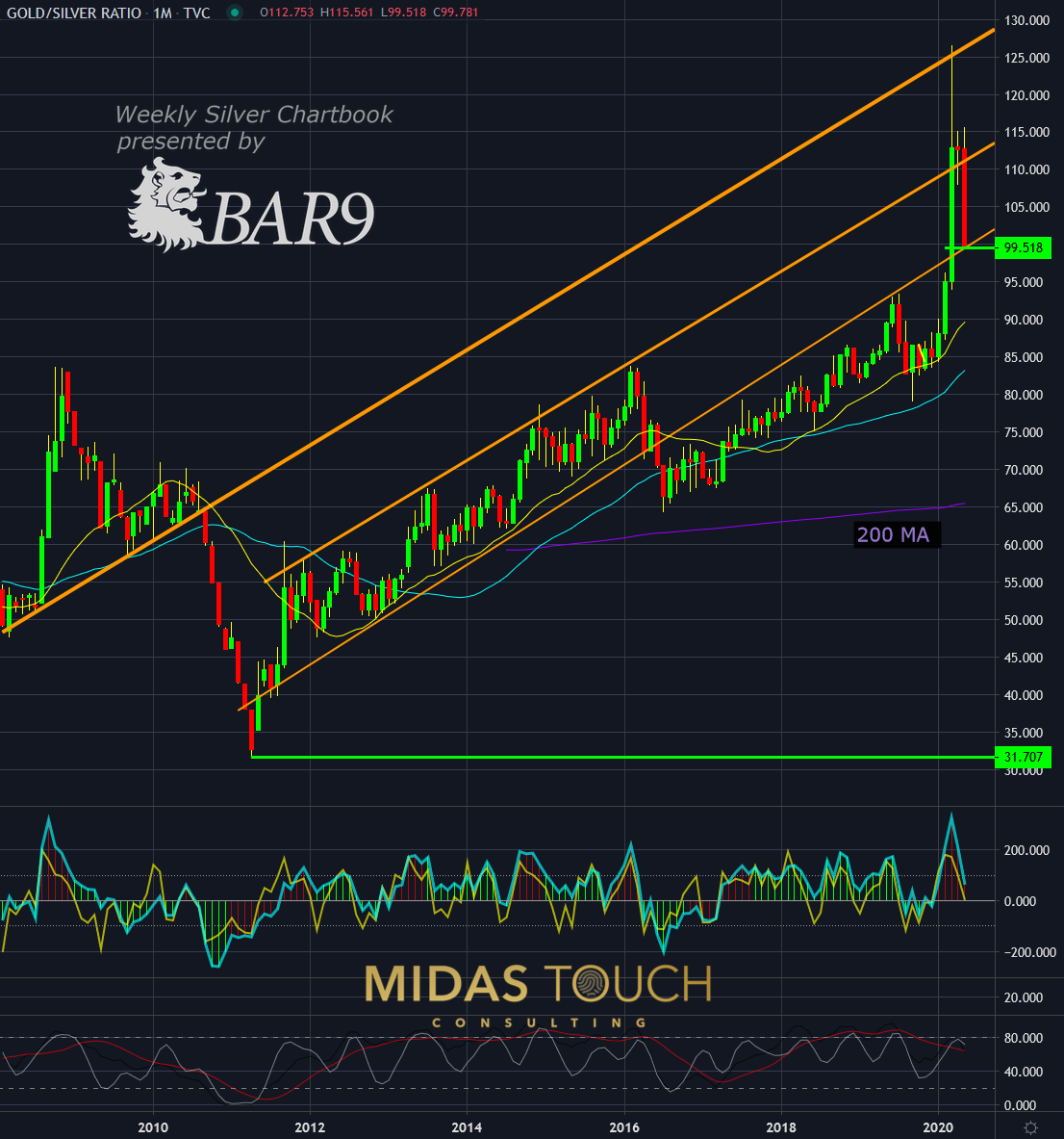
Silver might start outperforming GOLD…..
and yield curve might start to re steepen again with help from short term yield capped by central banks.
Most investors are not ready for the change in this narrative and by the time they start repositioning their portfolio to reflect the new realities… major gains would have already been made.