Summary
High debt levels have been a significant contributor to the fragility of global economies in response to the pandemic shutdown.
These high debt levels can be “fixed” by reducing debt (numerator) or increasing the money supply (denominator). The latter is more often the case, historically.
The U.S. money supply is expanding more rapidly than that of Japan and the Eurozone, and is likely to continue doing so.
The world has a debt problem.
Specifically, debt as a percentage of GDP has climbed to very high levels throughout the world. Developed markets on average have much higher debt than emerging markets, but emerging markets often owe debt in currencies they don’t control (like dollars), so it’s a very large problem all around the globe, albeit with different magnitudes and different styles in different places.
A 2019 report by the International Monetary Fund found that, using 2018 figures, total global debt was $188 trillion, or over 220% of global GDP. When private and public debts are added together, the United States, China, and the Euro Area have similar levels of total debt as a percentage of GDP, while Japan stands atop at the highest ratio of total debt to GDP.
The Bank for International Settlements keeps track of government and non-financial sector private debt as a percentage of GDP for many nations. Here are their debt figures for some of the largest countries and economic regions:
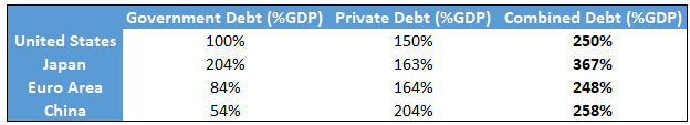
Data Source: BIS Statistics Warehouse
This article helps put some potential outcomes for these high debt levels in perspective as it pertains to financial asset class performance in the 2020’s.
The Long-Term Debt Cycle
Leverage has a tendency to gather in large super-cycles, in addition to typical business cycles.
Ray Dalio, founder of Bridgewater Associates, has a good visual that shows his conception of the relationship between the long-term debt cycle and the short-term business credit cycle:
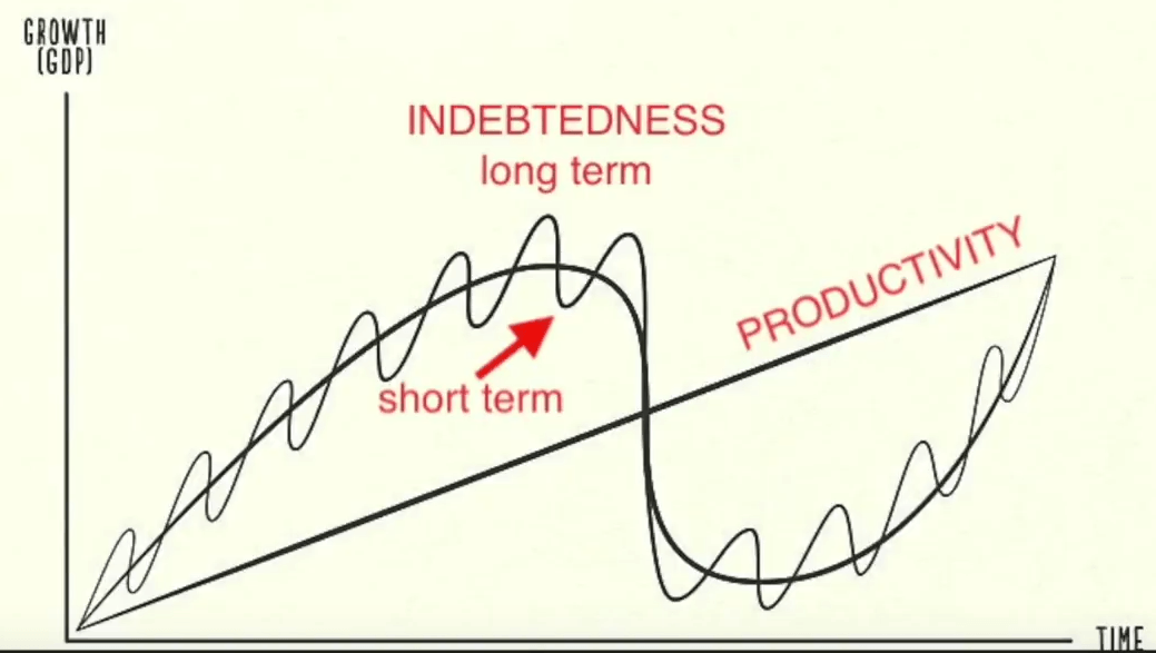
Chart Source: Ray Dalio
Over time, technology leads to productivity growth at what tends to be a pretty smooth rate. However, rapid debt accumulation can pull forward some of that growth to create a period of more rapid GDP growth (a “boom”), and then subsequent periods of deleveraging can give back some of that extra growth that was previously pulled forward (a “bust”).
During a typical 3-10 year business cycle, debt accumulates until a recession occurs, which forces a period of deleveraging to happen, and then upon recovery, debt starts to accumulate again. However, deleveraging rarely brings the debt as a percentage of GDP down to where it was in the beginning of the cycle, so each subsequent business credit cycle tends to finish and restart with a higher level of debt than the prior cycle.
Another key variable is interest rates. As interest rates decline during a long period of disinflation, governments, households, and companies can support higher absolute debt levels relative to GDP or income, while still being able to pay the interest on that debt. However, that excessive debt level makes businesses and other entities with debt fragile to economic shocks.
This debt accumulation over multiple cycles (lasting 50-100 years in total) is the long-term debt cycle. It eventually hits unsustainable levels and triggers a much larger deleveraging event that typically involves a currency devaluation to smooth out such a big, systemic adjustment.
In the United States, the Great Depression in the 1930’s was the culmination of the long-term debt cycle, and a period of massive deleveraging and currency devaluation occurred. We then spent the better part of a century accumulating debt as a percentage of GDP since then, and in recent decades we have built up an even larger debt relative to GDP than we had in the 1930’s.
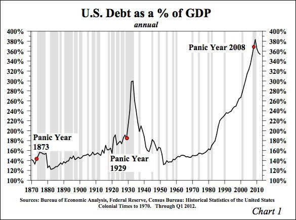
Chart Source: Hoisington Investment Management Co.
The U.S. Debt Problem
The United States has the global reserve currency, so this article will focus on the United States as the key example, but I’ll provide an interesting comparison to Japan as well.
As of the end of 2019, U.S. total debt of all types according to the Federal Reserve (meaning, it includes more than the BIS debt chart above) was equal to about 350% of U.S. GDP (red line below). If we just focus on debt in the non-financial sectors (federal government, state and local governments, households, and non-financial corporations), the ratio is just under 250% (blue line below), which roughly corresponds to the 250% BIS estimate.
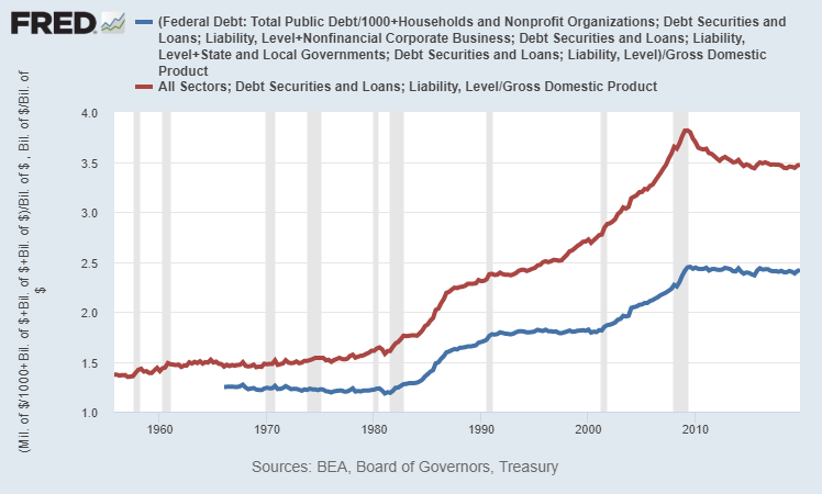
Chart Source: St. Louis Fed
We can break down the four major sub-components of non-financial sector debt (the blue line in the chart above) and see that after the 2008 crisis, a significant amount of the leverage moved from the private sector to the federal level, and yet overall private balance sheets are still quite leveraged:
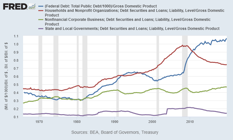
Chart Source: St. Louis Fed
This large amount of debt is a key reason for why so many consumers and businesses became insolvent in a two-month economic shutdown in response to a virus, and why trillions of dollars of bipartisan stimulus and money-printing happened within weeks of the shutdown. High debt levels create systemic economic fragility, to the point where mass-insolvency becomes a national security issue.
In recent years, people often said that the historically high debt levels don’t matter much because, thanks to low interest rates, debt servicing costs are low. This did allow households and businesses to hold elevated levels of debt. However, that argument only applies when everything works smoothly, in a non-inflationary and non-disrupted economic environment. A pandemic (and particularly the economic shutdown in response to that pandemic) came along and showed how fragile that situation was. The low interest rate and its effect on debt servicing costs don’t matter much for either households or businesses if they lose their income while they still have a ton of debt on the balance sheet.
As a measure of system resiliency/fragility, absolute debt levels relative to metrics like GDP and income levels matter, even in low interest rate environments. Debt levels are also a measure of how much financial asset value we’ve extracted and multiplied, relative to the base economic reality.
Exter’s Pyramid
The 20th century economist John Exter has a well-known visual conception of the financial system called Exter’s Pyramid, and here’s a simple version of it:
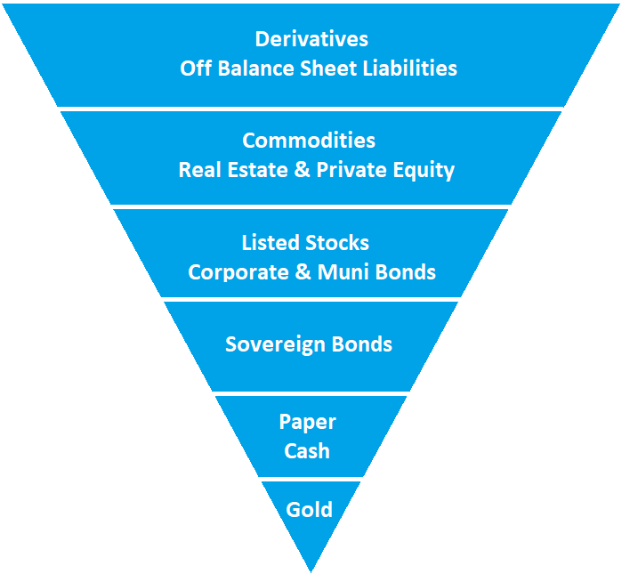
The pyramid is inverted because each layer of the pyramid is much larger than the one beneath it. The foundation assets like gold and cash are dwarfed in market size by the riskier sections of debt, equity, and derivatives.
- At the bottom of Exter’s pyramid is gold, the small foundation, because dollars and other currencies were still backed by gold in Exter’s career. In some forms of the visual representation, the gold section is separate from the rest of the pyramid. The United States officially has about $400-$500 billion worth of gold as reserves, depending on price levels in recent months.
- The next layer up is paper cash or in today’s more common form, digital money. At the core of this is the monetary base, and from there it expands into narrow and broad measures of total money supply in the fractional reserve banking system.
- Then up from there is the layer of sovereign bills, notes, and bonds. These are promises to pay cash in the future, and are considered to have near-zero nominal default risk, but do have interest rate risk and purchasing-power risk.
- Up from there is a couple layers that include the universe of private and local government assets, ranging from stocks to corporate bonds to municipal bonds to private equity and real estate. These securities and other assets have default risk, in addition to interest rate risk and purchasing-power risk.
- At the top of the inverse pyramid is the derivatives market, e.g. options and futures. This layer of the pyramid is also sometimes thought to include unfunded liabilities.
The “wider” the upside-down pyramid is, the more top-heavy and unstable it is, with lots of debt and expensive equity markets. The “narrower” the upside-down pyramid is, the more stable it is. This is unlike a normal pyramid that would be more stable as it gets wider.
For example, a wider upside-down Exter’s Pyramid would typically have a higher ratio of debt-to-cash within the system (which is less stable), and a narrower pyramid would typically have a lower ratio of debt-to-cash within the system (which is more stable). Most or all modern economies have more debt than cash, but it’s a matter of ratios.
Long-term debt cycles often run into deleveraging events when the pyramid becomes very wide, with an incredible amount of debt relative to cash in the financial system. There becomes a shortage of cash from which to support existing debts, and this gets exposed during an otherwise normal economic downturn.
In other words, one of the typical recessions turns into something bigger when a short-term business cycle deleveraging event crashes into an extremely wide Exter’s pyramid that doesn’t have much flexibility, and it results in a bigger long-term deleveraging period, as we saw starting in the 1929 and 2007 timeframes, and lasting for many years from those peaks.
“Fixing” the Debt: Narrowing the Pyramid
The government and central bank can’t directly control the GDP, which is a measure of economic output. They can, however, significantly control the money supply.
Some people think that commercial banks alone control the money supply based on how much they lend and how much demand there is for lending, but it’s important to realize that the government and central bank can also directly send money to people in the form of helicopter checks, extra unemployment benefits, social security, housing support, healthcare support, tax cuts/credits, federal student loan forgiveness, or indirectly through major infrastructure programs.
In other words, the federal government can run massive fiscal deficits that are funded by QE debt monetization (when the Federal Reserves creates new dollars to buy newly-issued Treasury securities to fund government spending), and those deficit dollars get injected into the economy in various ways and find their way into the broad money supply, outside of the fractional reserve commercial bank lending channel.
So, when it comes to “fixing” the debt at the end of a long-term debt cycle, it’s important to keep in mind that the financial system can either reduce debt, or increase GDP and/or money supply to come up and more closely match the debt. The goal from the perspective of policymakers is to decrease the debt relative to GDP and/or the money supply, and to do that, either the nominal debt can go down or nominal GDP or money supply can go up.
The Great Depression Example
If we look at that Great Depression debt/GDP chart again, we can see how rapid the deleveraging was in 1933:
Chart Source: Hoisington Investment Management Co.
So what happened? Did everyone just default or suddenly pay off debts? No.
A significant amount of defaults and deleveraging occurred through the whole period from 1930 through 1933, and that in part led to GDP contracting, so debt as a percentage of GDP kept going up. In 1934, the dollar was devalued over 40% relative to its gold peg (from roughly 1/20th of an ounce to 1/35th of an ounce), and the government greatly expanded the monetary base (i.e. “printed money”) to fund all sorts of programs.
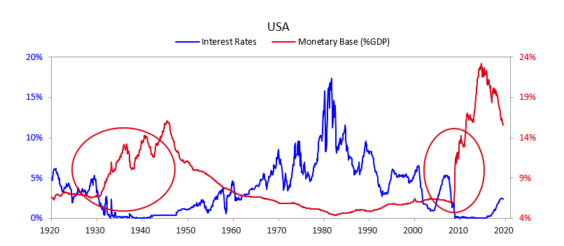
Chart Source: Bridgewater Associates, Ray Dalio, mid-2019
A big “deleveraging” occurred because all existing debts were essentially devalued relative to a much larger money supply and relative to the gold peg.
This policy naturally favored debtors over creditors, and turned a deflationary cycle (1930-1933) into a reflationary cycle (1934-onward). It also happened to boost the velocity of money, so nominal GDP went up as well. It was not without major drawbacks, especially for folks who were holding dollars or were creditors that were owed dollars, since the purchasing power of those dollars was diminished.
Total M2 money supply, after having collapsed during the default/deleveraging/deflation period from 1930-1933, quickly doubled over the next several years during the post-devaluation reflationary period:
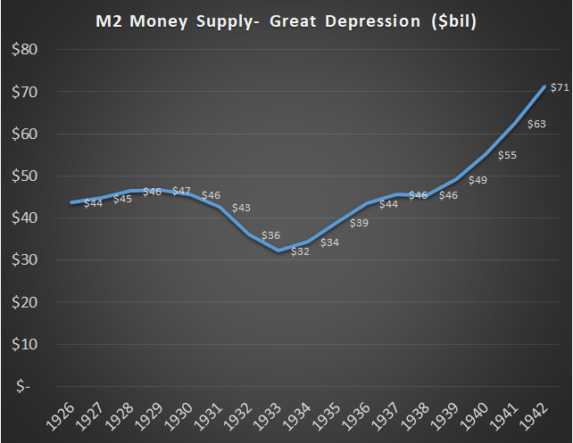
Data Source: San Jose State University Department of Economics
We can look back into thousands of years of history, through American history, into longer European history, and then deep into ancient Roman and Greek and Mesopotamian history, to see that widespread long-term debt structural problems are often resolved with major currency devaluations and/or outright debt jubilees. Like it or not, that’s just how it goes.
Because the government can control money supply more directly than GDP, a useful ratio to be aware of is the total debt in the system divided by the broad money supply. In other words, how many dollars are promised to be paid in the future (i.e. debt) relative to how many dollars exist now? The higher that ratio, the wider Exter’s inverted pyramid is, at least in terms of that particular measure, which makes it more unsustainable and fragile.
I’ve been tinkering with that Bridgewater/Dalio chart above recently because I wanted a version with post-pandemic May 2020 numbers. Here’s my update and annotation:
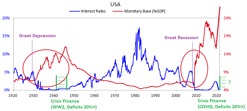
Chart Source: Bridgewater Associates, Ray Dalio, Updated/Annotated by Lyn Alden
In many ways, the 2010’s were eerily similar to the 1930’s, and the 2020’s are shaping up to be eerily similar to the 1940’s, in terms of fiscal and monetary policy.
Modern Situation
Here’s the recent ratio of total debt to broad money supply over time, as of the end of 2019:
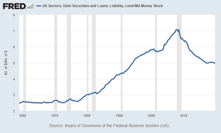
Chart Source: St. Louis Fed
The 1960’s and 1970’s were the low point on the long-term debt cycle, meaning that debt as a percentage of GDP (and as a percentage of money supply) were low. Specifically, the ratio of debt to broad money supply averaged about 2.5x for quite a while.
Starting from the late 1970’s, debt as a percentage of GDP and money supply began accumulating (which not coincidentally, also involved a secular bull market in equities). Debt as a percentage of money supply peaked in 2007 at a ratio of over 7x.
During the crisis of 2008, absolute debt was over $54 trillion and never went down from that point; it trended sideways for a couple years as the private sector deleveraged a bit and the federal government took on a lot more debt, and then total debt started accumulating again. However, money supply grew faster than debt from 2008 and onward, so the debt-to-money-supply ratio went from as high as 7x in 2007 down to only 5x at the end of 2019. This chart shows total debt (blue line) and broad money supply (red line) separately in nominal terms:
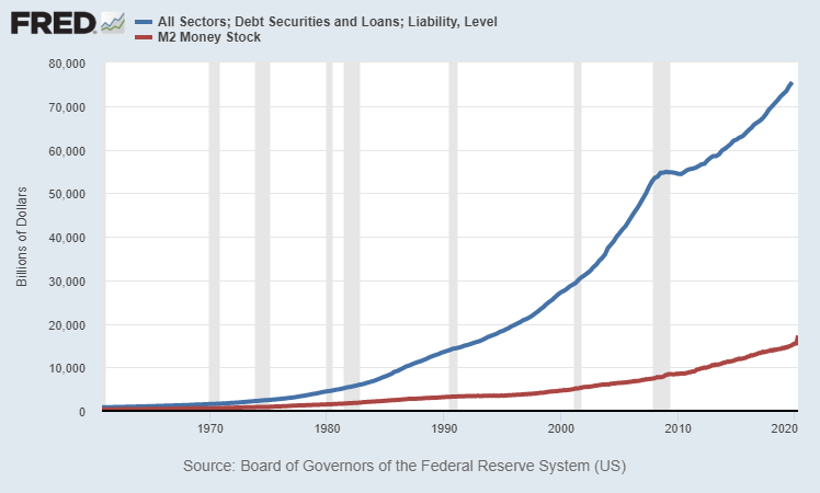
Chart Source: St. Louis Fed
In the coming several years, we should expect the ratio of total debt as a percentage of money supply to continue to move closer to 3x or below, and this pandemic recession will accelerate another leg lower. This is in part due to debt monetization; a significant portion of new debt, especially federal debt, is funded by new dollar creation from the Federal Reserve (QE), rather than extracted from actual lenders in the economy as it was prior to 2008. In other words, money supply will likely continue growing faster than total debt in percent terms.
For reference purposes, at the current amount of $75 trillion in total U.S. debt, a 3x ratio or below would be $25 trillion or more in broad money supply. If total debt goes up to $90 trillion in several years, a 3x ratio or less would mean $30 trillion or more in money supply. The current money supply in May 2020 is a little over $18 trillion.
If we specifically look at the ratio of U.S. federal debt to the broad money supply (rather than total debt to the broad money supply), it looks like this:
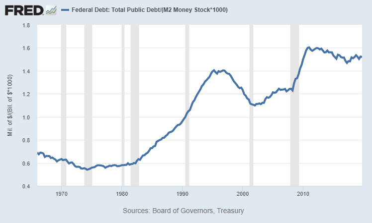
This ratio was under 0.75 for much of the 1960’s, 1970’s, and 1980’s, but for a while now has been over 1.50, or about twice as high. Because debt moves up to the sovereign level as crises unfold, this ratio is harder to get down without a combination of higher inflation and yield curve control, which are both currently Federal Reserve targets to accomplish according to FOMC meeting minutes and Federal Reserve official inflation targets.
Post-Virus
In response to the economic shutdown that occurred due to COVID-19, fiscal and monetary authorities in the United States and much of the rest of the world spent and printed a lot of money to offset the big deflationary shock and GDP contraction that is occurring. The total U.S. response (fiscal spending plus central bank money-printing) was larger relative to GDP than most other countries so far.
As GDP went down, the U.S. money supply went vertically upward. Money supply started this year at $15.3 trillion and went to over $18 trillion by late May.
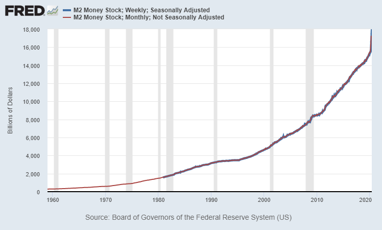
Chart Source: St. Louis Fed
In year-over-year percent change terms, the growth in broad money supply is growing at the fastest rate in modern history:
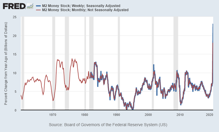
Chart Source: St. Louis Fed
So, we’re already seeing a narrowing of the pyramid in terms of debt-to-cash, with broad money supply most likely rising as fast as total debt added to the system, which drives the ratio lower.
For example, if total debt has jumped from $75 trillion at the end of 2019 to $79 trillion in mid-2020 (mostly from federal debt increases), and we know that money supply is now over $18 trillion, then the ratio has already narrowed to about 4.4x as of May 2020, from 5.0x at the start of the year.
United States vs Japan
Japan often gets singled out as having the most debt relative to the size of its economy. However, although Japan has the highest total debt-to-GDP ratio in the world, the United States has a higher total debt-to-money-supply ratio.
As of the end of 2019, the U.S. broad money supply was only about 0.7x of U.S. GDP ($15.3 trillion in broad money supply vs $21.7 trillion in GDP). For Japan, that ratio was more like 1.9x (just over 1 quadrillion yen in broad money supply and 550 trillion yen in GDP). In Japan, the money supply is far larger and money velocity is far lower.
If we look at government debt, which is the easiest to calculate and display, although Japan has a higher amount of government debt as a percentage of GDP, they actually have a lower percentage of government debt relative to money supply than the United States:
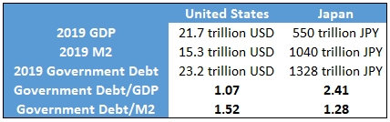
Data Sources: U.S. Federal Reserve, Bank of Japan, TradingEconomics.com
The same holds true for a total public+private debt calculation as well. Japan has more total debt relative to GDP than the United States, while the United States has more total debt relative to the money supply than Japan.
If we chart the money supply of Japan and the United States from the beginning of the data set from 1960 and onward, normalized to 100 in 1960, we can see that Japan’s money supply grew far faster than the money supply of the United States over the long run.
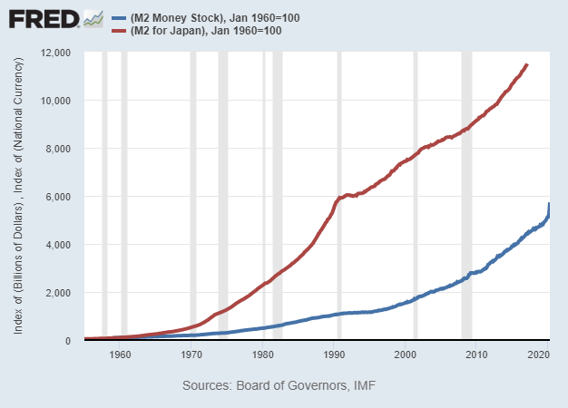
Chart Source: St. Louis Fed
However, if we normalize it to 100 in the year 2000 and chart from there, the United States’ money supply has been growing much more quickly than Japan’s money supply in recent decades:
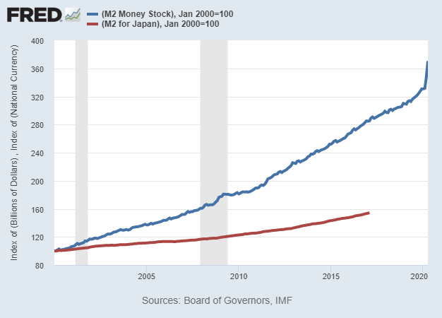
Chart Source: St. Louis Fed
The same is true if your normalize it to 1990 or 2010, and even if you adjust it for differences in population growth as well. In these more recent decades, US money supply has been growing much faster in percentage terms than Japanese money supply from its existing level. This particular data set charted by the St. Louis Fed ends in 2017 but more recent data from other sources shows that this remains the case into the 2018-2020 period. The United States has been “catching up” to Japan in terms of increasing the total money supply and reducing the velocity of that money supply.
Over the past decade, this is true for the U.S. money supply vs the Eurozone money supply as well, meaning that U.S. money supply has been growing more rapidly from the starting baseline.
In my view, when it comes to currency analysis, too many analysts focus heavily on past monetary expansion (e.g. “Japan has printed a lot more money than the U.S.”), and don’t focus enough on the rate of change of current and future monetary expansion (e.g. “the U.S. is now printing money at a more rapid pace than Japan, and has been for a while”).
Final Thoughts
The ending of the previous long-term cycle and major economic depression in the United States had two phases: one for the 1930’s and one for the 1940’s.
1930’s: Private Debt Bubble, Banking Crisis, Disinflation
After the 1929 peak, a recession and major asset price collapse began. In the 1930’s, total debt as a percentage of GDP peaked, but it was primarily a private debt bubble. Federal debt as a percentage of GDP was pretty low, while private debt was extremely high. This massive crisis and deleveraging event resulted in a bank crisis and the biggest economic contraction in U.S. history. Money was printed and currency was devalued, but due to the major destruction in other net worth, it was not a very inflationary event. The first few years were outright deflationary, and then the money-printing turned it into a mildly reflationary environment, but the overall decade saw low inflation or disinflation.
1940’s: Federal Debt Bubble, Wartime Finance, Inflation
In the 1940’s, private debt had gone down considerably as a percentage of GDP due to all of this deleveraging and expansion of the money supply, but due to World War II, federal debt as a percentage of GDP skyrocketed. This era of wartime finance was inflationary due to massive spending and industrialization, with peak federal deficits exceeding 30% of GDP. However, the Federal Reserve used yield curve control (which was basically quantitative easing; creating dollars to buy Treasuries as needed) to peg Treasury bond yields to 2.5% or below despite higher inflation. Therefore, Treasuries significantly under-performed inflation for the decade and the government effectively inflated away its excess debt.
So far, we have an echo happening in the 2010’s and 2020’s.
2010’s: Private Debt Bubble, Banking Crisis, Disinflation
After the 2007 peak, a recession and major asset price collapse began. Total debt as a percentage of GDP peaked in 2008, but it was primarily a private debt bubble. Federal debt as a percentage of GDP was moderate (about 65%) at the start of the crisis, but quickly grew to over 100% in the subsequent years as the private debt bubble was mainly pushed up to the sovereign level. The massive deleveraging resulted in a bank crisis and the biggest economic contraction since the Great Depression. Money was printed via quantitative easing, but due to the major destruction in other net worth and several deflationary forces, it was still a disinflationary environment rather than inflationary environment, outside of certain key areas such as healthcare.
2020’s: Federal Debt Bubble, Pandemic Finance, Inflation?
In the 2020’s, private debt has gone flat for a while as a percentage of GDP (household debt is down while corporate debt is up), but federal debt began skyrocketing from an already high 106% of GDP baseline level in early 2020 due to the pandemic and subsequent economic shutdown. Federal deficits of 20-30% of GDP in 2020 have approached World War II levels for the first time in modern history, resulting in federal debt levels rapidly moving to 120-130% of GDP and likely higher in the years ahead. The Federal Reserve began discussing yield curve control in 2019, bought a massive amount of Treasuries in mid-March when foreigners sold over $250 billion in Treasuries and yields briefly spiked, and in recent FOMC meeting minutes they discussed yield curve control via ongoing Treasury purchases.
In line with a reflationary or stagflationary outlook combined with yield curve control from the Federal Reserve, I continue to be long-term bullish on precious metals in this environment, with a particular emphasis on silver at the current time. For this decade I also like certain cheap value/cyclical/foreign sectors over expensive growth/defensive/tech sectors broadly (when carefully-selected, with strong balance sheets and high returns on capital).
https://seekingalpha.com/article/4351314-fixing-debt-problem
I had a question? Before the 30s the world had the gold standard, currencies were pegged to the gold standard which meant that there could never be a run away devaluation unless a country could miraculously come up with copious amounts of gold.
Today countries have stored their wealth and value in the dollar as the world has given up on the gold standard. What would happen to several markets which have pegged their currencies to the dollar and its notional value. If that paper goes worthless who and what are they going to trade with it?
i think it would be difficult to go back to gold standard. i can only see SDR as a reserve currency in near future
Hi Ritesh,
Superb Insights! Thanks for putting down your thoughts in such a lucid way.
I really buy the idea of precious metals (especially silver) being a key beneficiary of reflationary/stagflationary trade. However, do you see the odds of stagflation higher than reflation? With all the supply disruptions and increasing disposable personal income, inflation is a high probability event. But we can witness a subdued period of growth given the lockdown and its subsequent effects.
In such a scenario, would equities be a good investment option given the current rally in prices?
Thanks
yes the companies which are asset owners or which can pass on the input price increase will be a beneficiary of this new environment.