by Bryce coward via Knowledge leaders capital blog
The returns of the 2009-2020 bull market were nothing short of extraordinary. From the 2009 low in the S&P 500 to the 2020 high, stocks gained a massive 488%, or nearly 18% on an annualized basis. This compares to an average nominal price return for US stocks of about 5.5% annualized going all the way back to 1896, or 6.7% in the post-war period. So, the recent bull market produced average annual returns more than 3x that of normal. Even if we measure the S&P 500’s full cycle performance from the low in 2009 through the low in 2020, that still gives us an annualized return of 14.5%, or nearly three times the annual average return through history.
Going forward, can this type of high return environment be replicated? To answer that question it helps to understand the sources of equity appreciation from the previous cycle and ask whether those things are likely to be repeated during this cycle.
Let’s start with decomposing earnings per share into its piece parts.
From the 2009 low in stocks through the recent high earnings per share rose about 265% in total (12.5% annualized, from about $43/share to about $157/share).
Contributing to this rise was rising sales, which increased about 33% in total, or 2.6% annualized.
The tax cuts enacted in 2017 also added significantly to aggregate earnings, boosting EPS by 19.3%.
Share buybacks were on a tear over the last five years, adding 1.3% to EPS in each of those years through the reduction in the denominator.
But share issuance was rampant at the beginning of the cycle. In total, share buybacks added 4.5% to aggregate EPS over the last bull market.
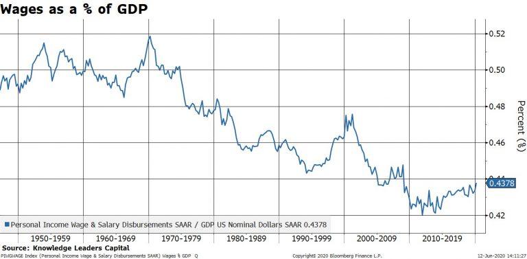
The final leg in EPS growth is what we will call ‘other margin expansion’. The aggregate profit margin for the S&P 500 expanded from 7.7% in 2009 to 11.8% in 2020. Some of this margin expansion was due to tax cuts, but most of it was due to lower interest rates (10-year rates fell from about 3.3% to 0.3% more recently), and wages falling relative to aggregate output (wages as a percent of GDP fell from 45%, to an all-time low of 42% in 2011, and have recently risen back to 43.5%).
As previously stated, the S&P 500 rose by 488% over the previous cycle. Roughly 265% of this was due to higher earnings, and the rest was due to multiple expansion. The P/E ratio rose from about 10 in early 2009 to about 22 at the beginning of 2020, which is a 220% rise. So, 60% of the appreciation in the S&P 500 came from earnings growth and the other 40% came from multiple expansion.
In the next chart we put all this together into a breakdown the S&P 500’s total appreciation into the granular piece parts.
With that behind us, we need to analyze each component of share price appreciation from the last cycle to in order to judge whether it is likely to be repeated this next cycle.
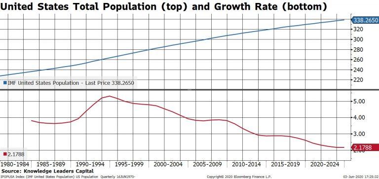
Sales growth. Are aggregate sales likely to rise by 2.6% annualized going forward? Sales growth closely tracks population growth. From 2009-2019 the US population grew by 3% per year on average. From now until 2024, the IMF estimates that the US population will only grow 2.25% per year on average. A 0.75% lower rate of population growth in the years to come vs the previous decade would seem to imply a lower aggregate level of sales growth for the S&P 500 this cycle compared to last cycle.
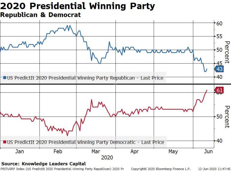
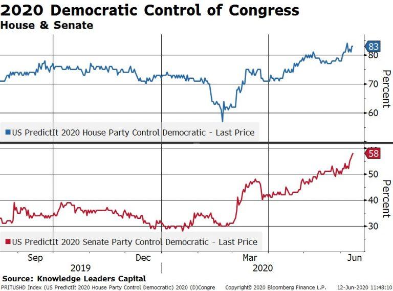
Tax cuts. It would stretch the imagination to assume another round of massive corporate tax cuts in the years ahead, even if the Republican party were to sweep in November. Alternatively, if the Democrats sweep, the corporate tax rate is likely to rise to 28% (it’s a campaign promise by Joe Biden). Currently, Biden is the odds on favorite to take the White House and the Democrats are the favorites to retake the Senate. Therefore, tax cuts certainly cannot be counted on for EPS growth this time around and may in fact reduce aggregate EPS.
Share buybacks. In the age of bailouts the term “share buyback” has taken on a negative connotation. Even if there is not legislation regulating buybacks in the coming years, we are hard pressed to assume a higher level of buybacks during this cycle compared to last. For this reason, the buyback factor may be neutral this cycle compared to last.
Other margin expansion. With the 2-year Treasury rate at 19bps, the 10-year at 70bps, and BAA spreads only a bit above average at 292bps, we are hard pressed to see another significant interest rate reduction being a catalyst for margin expansion this cycle. At the same time, wages as a share of GDP are still only slightly above the post-war low. A Blue wave in November would certainly usher in policies to help swing the pendulum back in favor of labor at the expense of capital. Therefore, margin expansion due to lower wages as a percent of output would seem an unlikely source of margin expansion.
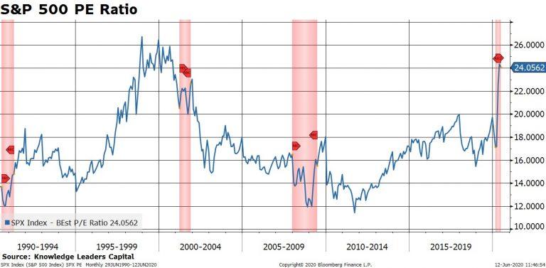
Finally, multiple expansion. At the beginning of the last market cycle the S&P 500 was sporting a forward PE of 10x. Back in March, the PE only reached a nadir of 17x and is already back to 25x. Could the forward multiple double from the March low and reach 34x? Anything is possible (see negative oil prices). But even with Fed asset purchases (which empirically are accretive to multiples), we would be hard pressed to count on multiples topping those from the 1999-2000 period by a wide margin.
In sum, the last market cycle was a unique one in terms of the aggregate stock price appreciation as well as its sources. Some of those sources were clearly one offs (tax cuts), while others may have simply reached their logical limits (interest rates, wages as a share of output). In the end, we find lots of reasons to expect lower EPS growth and less multiple expansion during this market cycle than last. At the very least, this means we have to re-calibrate our return assumptions moving forward and not expect a repeat of the 2009-2020 cycle. At worst, it could mean that achieving even average equity returns over the coming years could be a challenge.
While not exactly a chart but Russell Napier has changed his view and wrote an article titled ” The dawning of age of inflation” . He expects the inflation to cross 4% in developed world by 2021.
A key reason the US middle & working classes have seen stagnant relative real income growth over the past 45 years, in a single chart.
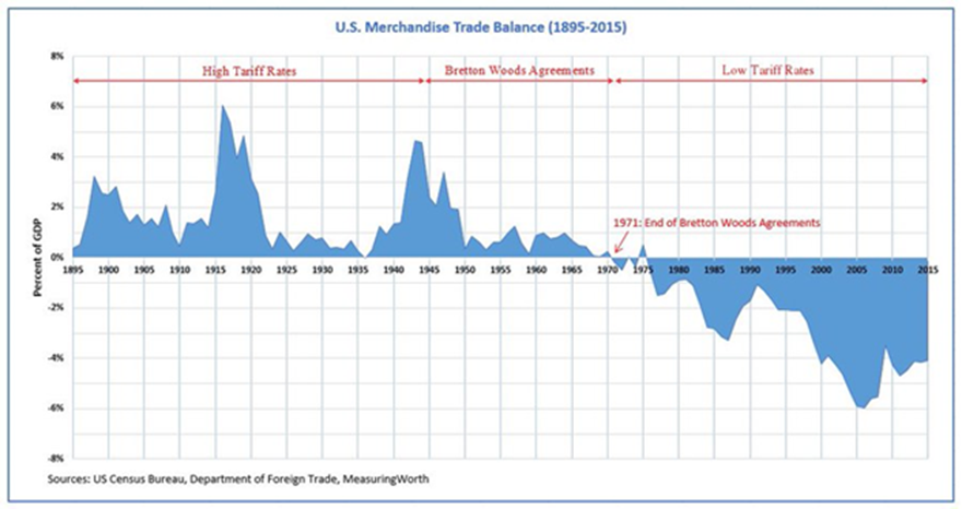
Trade and Tariff barriers are coming back
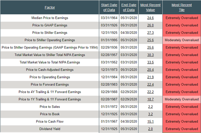
Let’s talk about valuations. Forward price-to-earnings (P/E) sits at 22.4. Median P/E (my favorite indicator, which looks at actual trailing 12-month earnings) sits at 24.6. For comparison purposes, the 52-year average, call it “Fair Value,” is 17.3. That suggests the S&P 500 Index’s fair value is 2,134.06. More than 30% below today’s level of 3,202. And it’s not just price relative to earnings. It’s price-to-sales, price-to-operating earnings, price-to-book. Price-to-everything is expensive. Here’s a look (red is bad):
Pre Covid-19, India’s last decade of growth was Debt financed household spending. This created winners in the market for companies who were part of this value chain from financiers who were funding tis growth to the companies who were recipient of this spending by the household.
As a result few companies have delivered outsized returns at the expense of everybody else due to it being a consumer debt financed growth.
As Debt levels peak the previous trends will reverse moving money elsewhere and create new winners
Covid will accelerate three trends
Onshoring of supply chains aided by subsidies, incentives and cheap cost of funds. Overruling of the WTO consensus worldwide will resurrect industries that were on the verge of extinction due to imports.
As countries like Japan, Europe and US look to diversify supply chains , the suppliers to the industries shifting to india will win huge.
The current QE in coordination with government spending is aimed at the real economy and as velocity of money picks up it will lead to inflationary outcomes. The governments will however exercise Yield control on bonds, making Resource , Argo commodities , gold and silver miners extremely bullish bets .
As a result of impending inflation, fixed income investments in duration of higher than 3 years is ill advised.
In a low growth world countries like Vietnam , Bangladesh among others will capture some part of the supply chains moving out of china. They will thus be poised for a outsized rally in their markets due to their growth prospects being similar to India 10 years ago.
The investments in global equities , precious metals miners and emerging trends like 3D printing or betting on nascent recovery in Europe is possible for Indian investors who can invest through LRS ( Liberalized Remittance Scheme) of RBI.
The WSJ ( known as mouthpiece for Fed) wrote last week that “Fed officials are thinking hard about” yield curve control, or pegging various duration at certain levels. It’s not clear from the article whether that’s conjecture, speculation or some kind of leak. However there is a detail in the report that suggests this is beyond conjecture: If the Fed concludes it is likely to hold rates near zero for at least three years, it could amplify this commitment by capping yields on every Treasury security that matures before June 2023.Another debate the article touches on is forward guidance and whether to tie it to the calendar or to economic outcomes. Yield caps would be a natural complement to the calendar-based guidance but could be trickier to communicate if paired with outcome-based guidance.
Peter Garny of saxo banks writes
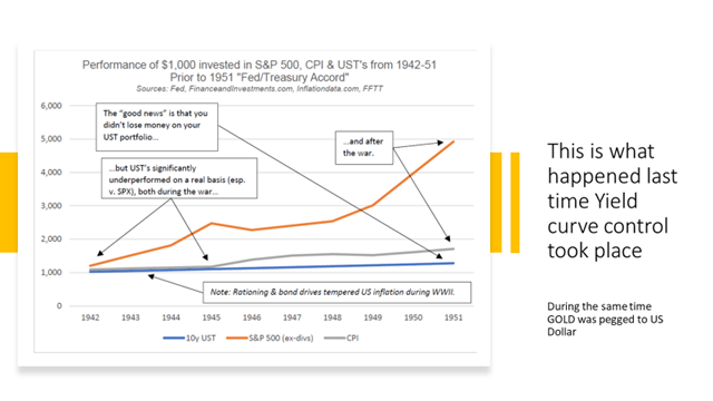
Yield-curve control has mixed results when it comes to equities. Japan’s YCC policy since September 2016 has not been a success judging from real GDP growth and for Japanese equities which have underperformed global equities. The period 1942-1951 when the Fed had a YCC policy in place suggests a more positive picture for equities against inflation hinting that YCC can work as a crisis tool.
However, the key risk related to YCC is inflation risk as our study of inflation and equity returns suggest inflation growth of 4% or higher leads to bad real rate returns for equities.
Which sectors will benefit from YCC?
The cap on long-term interest rates will also cap banks’ profitability through an upper bound on net interest margin. However, to the extend that YCC creates growth this will grow loan books and thus market values of banks. Our view is that financials should be avoided in this environment but that growth companies with a large part of their value coming from the future should be overweight as YCC creates a low discount factor for future cash flows.
Highly leveraged companies and capital intensive industries such as auto, airliners, steel, real estate, shipping, construction etc. should also outperform in this environment as YCC will set financing rates artificially low.
In nutshell you need to be with asset owners who will benefit from lower nominal value of debt and higher nominal value of assets
Inflation beyond a threshold in the danger to equities….
YCC combined with aggressive US government deficits could suddenly create inflation which history suggests has a tendency to be a wild beast when it escapes its normal ring-fencing. Higher inflationary pressures will not immediately become negative for equities because excess capacity coupled with inventories buildup provide a cushion for near term .
A mild positive inflation shock has historically been associated with positive real returns in equities.
It’s actually a large deflationary shock that has been associated with negative real returns.
Peter analysis concludes that
“Equities have historically delivered negative real return when inflation has sustained its growth rate above 4%. This is the real danger for equities.”
Repo Volumes are rising in a similar fashion to the beginning of the crisis in February. Liquidity is leaving the system. Last two days, repos (O/N and term) rose above $100Bn. S&P500 topped on February 19 while repo volumes were about half of what we are seeing today. By the time we hit $100Bn in repos (March 3), the index had dropped 10%.
We had about two weeks (March 3-March 22) of repos printing about $128Bn on average per day. S&P 500 bottomed on March 23 as the Fed started stepping in with its various programs. Repos went down below $50Bn on average a day. More importantly liquidity started flooding the system. Reverse repos skyrocketed from $5bn on average per day to $143Bn a day by mid-April! Equities rallied in due course.
April/May, things went back to normal: repo volumes between $0Bn and $50Bn a day and reverse repos averaging about $2-3Bn a day->Goldilocks: liquidity was just about fine. Equities were doing well. Then in the first week of June, repos jumped above $50Bn, and last Friday and today they went above $100Bn. Reverse repos are firmly at $0Bn: they have literally been $0Bn for the last 4 days.
Again, just like in February, liquidity is starting to get drained from the system. By that level of repo volumes in March, equities were already 10% lower from peak. S&P500 is just a couple % below that previous peak, but Nasdaq is above!
I am not sure why the market is here. It could be that, in a perfect Pavlovian way, investors are giving the benefit of the doubt to the Fed that it will announce an increase of its asset purchasing program at this week’s FOMC meeting. If it doesn’t, US equities are a sell.
And don’t be fooled by no YCC or any forward guidance. The Fed needs to step in the UST market big way. YCC on 2-3 year will do nothing. Fed needs to do YCC on at least up to 10yr. As to really address the liquidity leaving the system, Fed needs to at least double its weekly UST purchases.
Fed is now probably considering which is worse: a UST flash crash or a risky asset flash crash. Or both if they play their hand wrong.
Looking at the dynamics of the changes in the weekly Fed balance sheet, latest one released last night, a few things spring up which are concerning.
1.The rise in repos for a second week in a row – a very similar development to the March rise in repos (when UST10yr flashed crashed). The Fed’s buying of Treasuries is not enough to cope with the supply hitting the market, which means the private sector needs to pitch in more and more in the buying of USTs (which leads to repos up).
This also ties up with the extraordinarily rise in TGA (US Treasury stock-piling cash). But the build-up there to $1.4Tn is massive: US Treasury has almost double the cash it had planned to have as end of June! Bottom line is that the Fed/UST are ‘worried’ about the proper functioning of the UST market. Next week’s FOMC meeting is super important to gauge Fed’s sensitivity to this development
2.Net-net liquidity has been drained out of the system in the last two weeks despite the massive rise in the Fed balance sheet (because of the bigger rise in TGA). It is strange the Fed did not add to the CP facility this week and bought only $1Bn of corporate bonds ($33Bn the week before, the bulk of the purchases) – why?
Fed’s balance sheet has gone up by $3tn since the beginning of the Covid crisis, but only about half of that has gone in the banking system to improve liquidity. The other half has gone straight to the US Treasury, in its TGA account. That 50% liquidity drain was very similar throughout the Fed’s liquidity injection between Sept’19-Dec’19. And it was very much unlike QE 1,2,3, in which almost 90% of Fed liquidity went into the banking system. See here. Very different dynamics.
Bottom line is that the market is ‘mis-pricing’ equity risk, just like it did at the end of 2019, because it assumes the Fed is creating more liquidity than in practice, and in fact, financial conditions may already be tightening. This is independent of developments affecting equities on the back of the Covid crisis. But on top of that, the market is also mis-pricing UST risk because the internals of the UST market are deteriorating. This is on the back of all the supply hitting the market as a result of the Treasury programs for Covid assistance.
The US private sector is too busy buying risky assets at the expense of UST. Fed might think about addressing that ‘imbalance’ unless it wants to see another flash crash in UST. So, are we facing a flash crash in either risky assets or UST?
Ironically, but logically, the precariousness of the UST market should have a higher weight in the decision-making progress of the Fed/US Treasury than risky markets, especially as the latter are trading at ATH. The Fed can ‘afford’ a stumble/tumble in risky assets just to get through the supply in UST that is about to hit the market and before the US elections to please the Treasury. Simple game theory suggest they should actually ‘encourage’ an equity market correction, here and now. Perhaps that is why they did not buy any CP/credit this week?
The Fed is on a treadmill and the speed button has been ratcheted higher and higher, so the Fed cannot keep up. It’s a dilemma (UST supply vs risky assets) which they cannot easily resolve because now they are buying both. They could YCC but then they are risking the USD if foreigners decide to bail out of US assets. So, it becomes a trilemma. But that is another story.
Fiat system goes critical with the dawn of the new decade, the world will become increasingly interventionist. In keeping with the motto “Once your worldly reputation is in tatters, the opinion of others hardly matters”, all the barriers to new debt are now being breached. Debt no longer plays a role, and zero interest rates and money supply expansion remain the order of the day as far as the eye can see.
What was obvious from writing this report was that, the main result of the fiscal and policy response globally to the virus, through monetary and fiscal policy and regulations, will be a structural shift to much bigger government, whatever political flag it is under. This will change the whole nature of society, perhaps best highlighted by Bloomberg which said German Chancellor Merkel’s stimulus package will result in the biggest re-engineering of the economy since post-war construction, installing the kind of state “capitalism” in Germany that borrows heavily from France or China. This is not the result of some devious plot as many assume, but rather the cost of sustaining the existing imbalances. Nevertheless, with the imbalances and costs so high, the changes to the shape of the economy and industry, both domestically and internationally, and the makeup of that industry in terms of competition and ownership etc, including passive vs active (the only game in town will be base money & fiscal spending) – will be massive.
The only chart that matters
I know cash flows and valuation matters for the patient long term investors but even warren Buffett has started complaining about lack of market opportunities due to heavy intervention by central bankers and famed investor Jeremy Grantham has reduced his equity allocation in his flagship GMO fund from 35% to 25% and was quoted in FT saying stock markets are “lost in one sided optimism”. It seems that now you need to take LIQUIDITY as granted and then use your skills to find the direction in which this LIQUIDITY is flowing. This kind of LIQUIDITY just makes the system more vulnerable as poorly run companies are also able to find money to continue operations and this brings down the productivity for the entire system.
if you are worried about whether this Tsunami of LIQUIDITY is creating distortions in asset prices wait till US Fed decides to CAP the bond yields. I believe the only way US can get back to its Trend growth growth is by reducing the value of US Dollar. The best way is to Cap the bond yields and let the inflation run hot. Lat time it happened was after second world war during 1942-1951 period and US was able to get back to fast growth lane by nominally defaulting on its debt.
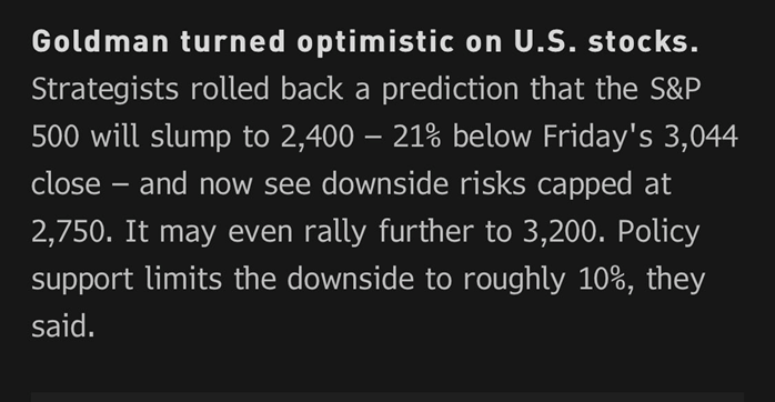
Goldman turns optimistic based on what Higher Prices?? Goldman turned optimistic on U.S. Stocks. Strategists rolled back a prediction that the S&P 500 will slump to 2400- 21% below Fridays 3044 Close – and now see the downside risks capped at 2750.It may even rally further to 3200.Policy support limits the downside to roughly 10%, they said.
What lays ahead for the Federal Reserve free money printing institution of the world
The United States’ Federal reserve’s balance sheet increased by USD441bn in May to USD7.06trn. Over the last 5 and 10 weeks, M2 money supply has grown at an annualised pace of 106% and 111% respectively. The growth is set to continue. The inert Treasury General Account soared to USD1.364trn, indicating that, to meet its own goal of it being down to USD800bn by the end of June and September, the Treasury must inject USD564bn into the economy, equivalent to over 3% of money supply in just over 4 weeks. Also, Boston Fed President Eric Rosengren said he expects companies to begin receiving money through the central bank’s Main Street Lending programme within 2 weeks, which the Boston Fed will be administering. The general message was of greater monetary and fiscal stimulus to come.
Have oil prices finally turned?
Looking into the Mirror is not helpful in investing
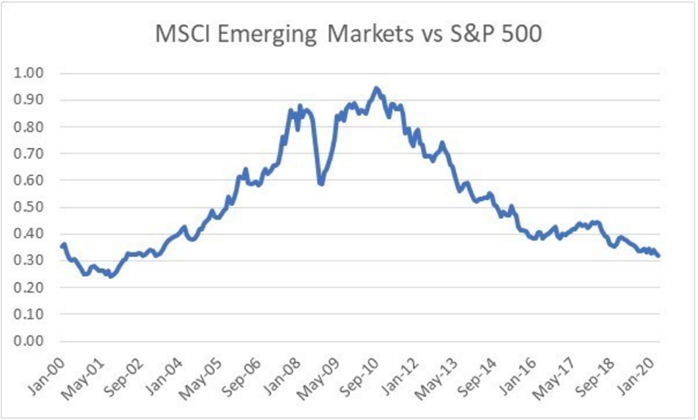
The first 20 years of the 21st century can be divided into two halves. The first half was the reflation trade, which was characterised by rising commodity prices, a weak US dollar, and strong growth. The second half has been the opposite, with falling commodity prices, weak growth and a strong dollar. Perhaps nothing shows this more clearly, that the relative performance of emerging markets, which greatly outperformed the S&P 500 in 2000s, and then gave back all that relative outperformance in 2010s.
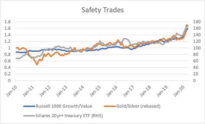
Collapsing yields and commodities have forced investors into a variety of “safety trades”. Growth stocks over value stocks, gold over silver, and long dated bonds. All have remarkably similar performance, particularly in recent years.
( chart courtesy: Horseman Capital)
The tale of two halves
2000-2010: Capital moves from Developed Markets TO Emerging Markets
2010-2020: Capital moves back from Emerging Markets TO Developed Markets
( chart courtesy: Horseman Capital)
Macro Outlook
2020-?
Changing underlying trends in oil, government spending and Chinese exports suggest that the macro trend of the 2010s will not be the same as the 2020s.
If the experience of changing macro trends from 2000s to 2010s are repeated, then the winners of last decade, will under perform the losers of last decade
COVID-19 has acted as a ‘Great Accelerator’ to many pre-existing socioeconomic and technological trajectories.
Trends in monetary and fiscal policy have also been accelerated. Not only in the amount of stimulus but also in merging the two forms of policy.
In many ways, merging the two is necessary, given that the historic reliance on monetary tools has left the real economy struggling while asset prices have rebounded.
A powerful narrative has emerged in the wake of COVID-19. ‘The Great Acceleration’ is the concept that previously existing socioeconomic developments have been pushed into overdrive. Tele-commuting, the dominance of big-tech, and the shift to online learning have all taken multi-year jumps forward in the space of just months. For instance, NYU Stern Professor Scott Galloway explains that post-secondary education models are permanently shifting here.
The economic fallout from COVID-19 has also provided new fuel for the prevailing trends in monetary and fiscal policy. The Fed has expanded its balance sheet by around $3 trillion in around 90 days.
Even before COVID-19 appeared, monetary easing was already ongoing. The Federal Reserve cut overnight rates three times before the global pandemic shocked the world (July, September and October of 2019). The ferociousness of the Fed’s response to the virus indicates that policymakers believed that liquidity conditions were tight, despite a 1.5% Fed Fund rate pre-virus.
Policy, Currencies, And Credit
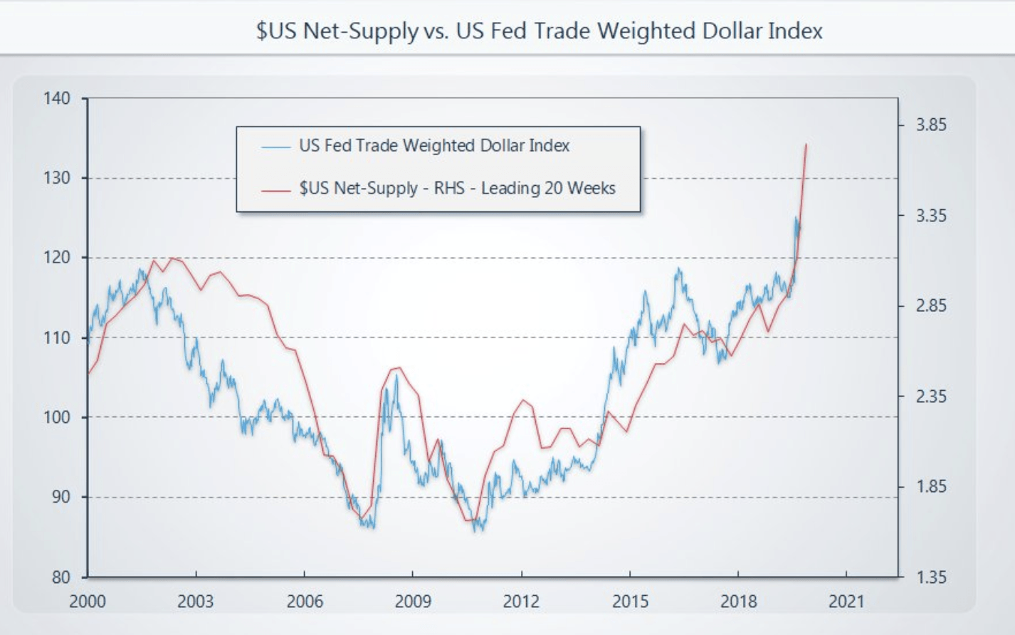
A strengthening USD amidst a growing Fed Balance Sheet has been a hallmark of the post-GFC period. This is somewhat counterintuitive to traditional economic doctrine. The rapid balance sheet expansion in March accelerated the post GFC trend. Below is a chart of net USD supply (M2 – Total US Denominated Debt) compared to the Trade Weighted Dollar Index.
Source: GMI
One explanation for this relationship is that through Quantitative Easing (QE), the money supply sits as excess reserves at institutions, while borrowing demand remains weak. Smaller entities that need dollars have a hard time getting them from banks. Larger, formerly highly-indebted companies focus on de-leveraging. This was a hallmark of Japan’s ‘lost decade’ through the 1990s.
Source: Bank of Japan
As monetary policy becomes easier, the velocity of money decreases. Central bank balance sheet expansion through QE and asset purchases increases asset prices but does not stimulate corporate capital expenditures. Below is a graph of U.S. money velocity as compared to commercial and industrial (C&I) loans outstanding.
Source: St. Louis Fed, BIS
The Japanese experience through the 1990s was somewhat different in the sense that the Yen did not carry the same global reserve currency status that the USD maintains. The offshore dollar borrowing market (Eurodollar market) has exploded in size over the past decade. This is the classic currency carry trade – the USD as a funding market for offshore recipient markets.
The market liquidity event through March caused massive stress in offshore dollar funding markets. As U.S. policymakers announced an unprecedented $7 trillion in monetary and fiscal stimulus through March and April, the trade-weighted dollar was unchanged over that period. This indicates how short of dollars global markets have been for years, punctuated by a liquidity event that exacerbated the prevailing trend.
The Next Chapter
So long as the U.S. dollar maintains strength, it’s likely that policymakers continue with massive fiscal and monetary initiatives to address the economic fallout from COVID-19. Policymakers would prefer a lower dollar, but the past ten years have shown the disconnect between dovish policy and the dollar.
The disconnect between market prices and the real economy is historic. The importance of fiscal policy to restore employment and consumer spending cannot be understated. The distinction between monetary and fiscal policy has effectively shrunk. As the U.S. Treasury issues stimulus cheques to individuals funded by Treasury bond issuances and the Fed purchases these securities through open market operations, we’ve crossed a bridge into MMT.
Difficulties in walking back balance sheet expansion were illustrated by the Q4/18 rejection of Powell’s quantitative tightening (QT) program. Given massive headwinds in employment, it will be incredibly challenging for policymakers to consider reductions in fiscal stimulus. If anything, policymakers will likely err on the side of more, rather than less.
The most prominent effect of stimulus is not CPI inflation, dollar weakness, or material increases in economic growth. Instead, it’s an appreciation in asset prices. The Fed is incentivized to continue to stimulate asset prices further.
Unfortunately, a major consequence of asset price inflation is the exacerbation of wealth inequality. This was traditionally due to ownership of assets being increasingly concentrated in the hands of the wealthy. Now we face another source of income equality: the benefactors of new economic stimulus being disproportionally large businesses while Main Street does not have the same access to capital. This was observed in Japan in the 1990s, and already there are signs of the same trend in the U.S.
In Conclusion
The reliance on monetary policy as a stimulus tool has accelerated through the coronavirus epidemic, just like many other trends across society. The emergent phenomena of combining fiscal and monetary policy is also making a surge forward.
This combination is necessary given the disconnect between asset prices and the state of the real economy. History suggests that businesses prefer to de-lever rather than borrow after facing insolvency scares. Policymakers have much more experience in monetary expansion compared to directly injecting capital into individuals’ bank accounts. The transmission mechanisms for the former are tried and tested, whereas the implementation of policies resembling MMT is embryonic.
The widening gap between the well-being of the average American and the level of asset prices adds to the palpable state of societal unease, particularly among low-income earners. Policymakers understand this, and I would expect a massive fiscal response. However, these tools are new and less battle-tested than monetary policy, which will also continue to be used heavily. The implications for further monetary expansion are easier to see (higher asset prices) than an acceleration in monetization of fiscal deficits. But it’s hard to imagine that the usage of both sets of tools will not continue to accelerate at breakneck speed.
High debt levels have been a significant contributor to the fragility of global economies in response to the pandemic shutdown.
These high debt levels can be “fixed” by reducing debt (numerator) or increasing the money supply (denominator). The latter is more often the case, historically.
The U.S. money supply is expanding more rapidly than that of Japan and the Eurozone, and is likely to continue doing so.
The world has a debt problem.
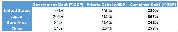
Specifically, debt as a percentage of GDP has climbed to very high levels throughout the world. Developed markets on average have much higher debt than emerging markets, but emerging markets often owe debt in currencies they don’t control (like dollars), so it’s a very large problem all around the globe, albeit with different magnitudes and different styles in different places.
A 2019 report by the International Monetary Fund found that, using 2018 figures, total global debt was $188 trillion, or over 220% of global GDP. When private and public debts are added together, the United States, China, and the Euro Area have similar levels of total debt as a percentage of GDP, while Japan stands atop at the highest ratio of total debt to GDP.
The Bank for International Settlements keeps track of government and non-financial sector private debt as a percentage of GDP for many nations. Here are their debt figures for some of the largest countries and economic regions:
This article helps put some potential outcomes for these high debt levels in perspective as it pertains to financial asset class performance in the 2020’s.
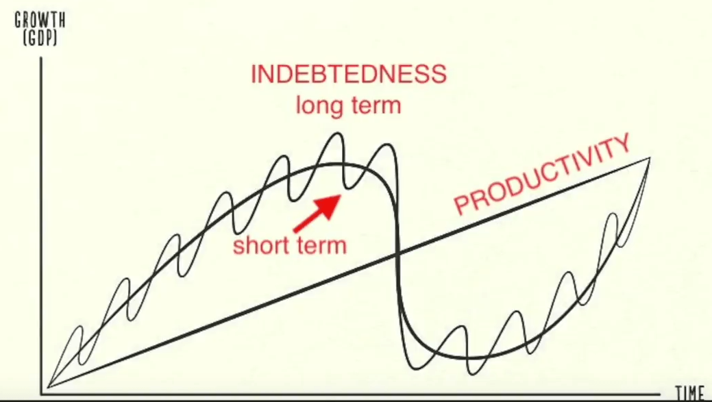
The Long-Term Debt Cycle
Leverage has a tendency to gather in large super-cycles, in addition to typical business cycles.
Ray Dalio, founder of Bridgewater Associates, has a good visual that shows his conception of the relationship between the long-term debt cycle and the short-term business credit cycle:
Chart Source: Ray Dalio
Over time, technology leads to productivity growth at what tends to be a pretty smooth rate. However, rapid debt accumulation can pull forward some of that growth to create a period of more rapid GDP growth (a “boom”), and then subsequent periods of deleveraging can give back some of that extra growth that was previously pulled forward (a “bust”).
During a typical 3-10 year business cycle, debt accumulates until a recession occurs, which forces a period of deleveraging to happen, and then upon recovery, debt starts to accumulate again. However, deleveraging rarely brings the debt as a percentage of GDP down to where it was in the beginning of the cycle, so each subsequent business credit cycle tends to finish and restart with a higher level of debt than the prior cycle.
Another key variable is interest rates. As interest rates decline during a long period of disinflation, governments, households, and companies can support higher absolute debt levels relative to GDP or income, while still being able to pay the interest on that debt. However, that excessive debt level makes businesses and other entities with debt fragile to economic shocks.
This debt accumulation over multiple cycles (lasting 50-100 years in total) is the long-term debt cycle. It eventually hits unsustainable levels and triggers a much larger deleveraging event that typically involves a currency devaluation to smooth out such a big, systemic adjustment.
In the United States, the Great Depression in the 1930’s was the culmination of the long-term debt cycle, and a period of massive deleveraging and currency devaluation occurred. We then spent the better part of a century accumulating debt as a percentage of GDP since then, and in recent decades we have built up an even larger debt relative to GDP than we had in the 1930’s.
The United States has the global reserve currency, so this article will focus on the United States as the key example, but I’ll provide an interesting comparison to Japan as well.
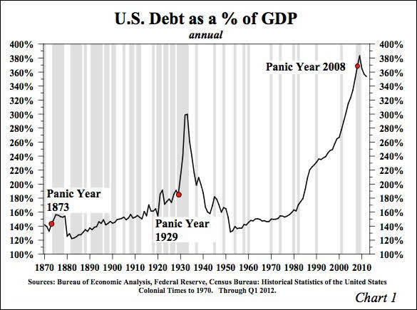
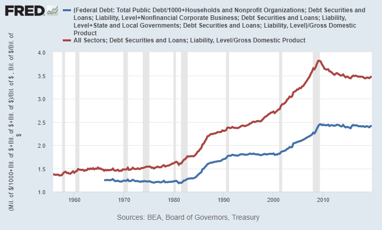
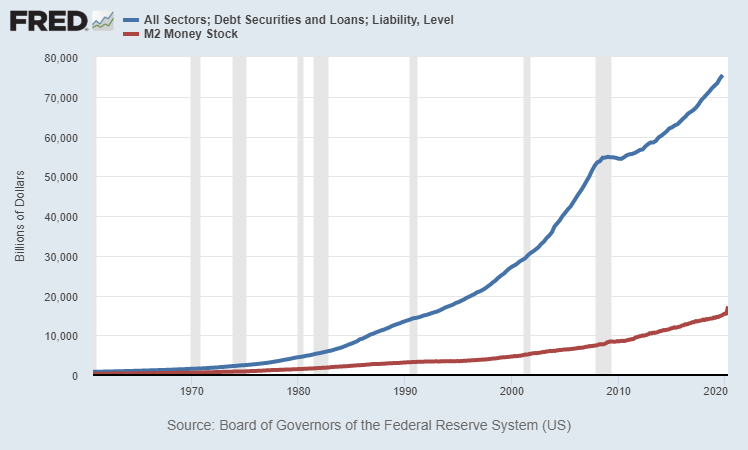
As of the end of 2019, U.S. total debt of all types according to the Federal Reserve (meaning, it includes more than the BIS debt chart above) was equal to about 350% of U.S. GDP (red line below). If we just focus on debt in the non-financial sectors (federal government, state and local governments, households, and non-financial corporations), the ratio is just under 250% (blue line below), which roughly corresponds to the 250% BIS estimate.
Chart Source: St. Louis Fed
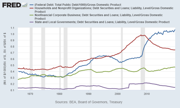
We can break down the four major sub-components of non-financial sector debt (the blue line in the chart above) and see that after the 2008 crisis, a significant amount of the leverage moved from the private sector to the federal level, and yet overall private balance sheets are still quite leveraged:
Chart Source: St. Louis Fed
This large amount of debt is a key reason for why so many consumers and businesses became insolvent in a two-month economic shutdown in response to a virus, and why trillions of dollars of bipartisan stimulus and money-printing happened within weeks of the shutdown. High debt levels create systemic economic fragility, to the point where mass-insolvency becomes a national security issue.
In recent years, people often said that the historically high debt levels don’t matter much because, thanks to low interest rates, debt servicing costs are low. This did allow households and businesses to hold elevated levels of debt. However, that argument only applies when everything works smoothly, in a non-inflationary and non-disrupted economic environment. A pandemic (and particularly the economic shutdown in response to that pandemic) came along and showed how fragile that situation was. The low interest rate and its effect on debt servicing costs don’t matter much for either households or businesses if they lose their income while they still have a ton of debt on the balance sheet.
As a measure of system resiliency/fragility, absolute debt levels relative to metrics like GDP and income levels matter, even in low interest rate environments. Debt levels are also a measure of how much financial asset value we’ve extracted and multiplied, relative to the base economic reality.
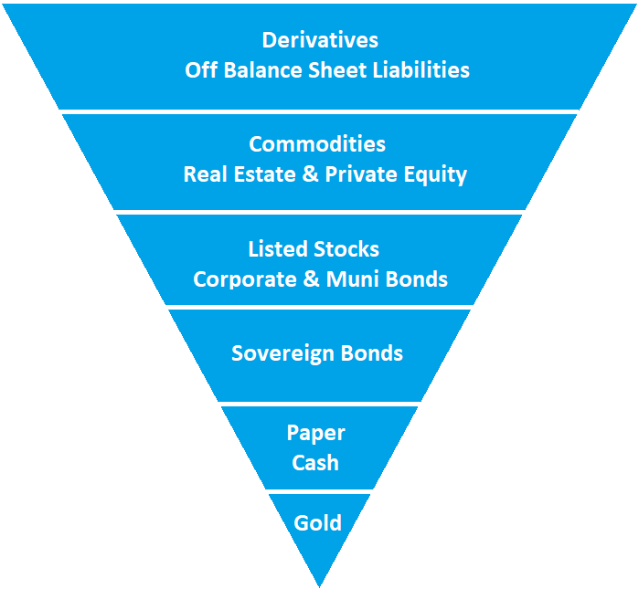
Exter’s Pyramid
The 20th century economist John Exter has a well-known visual conception of the financial system called Exter’s Pyramid, and here’s a simple version of it:
The pyramid is inverted because each layer of the pyramid is much larger than the one beneath it. The foundation assets like gold and cash are dwarfed in market size by the riskier sections of debt, equity, and derivatives.
At the bottom of Exter’s pyramid is gold, the small foundation, because dollars and other currencies were still backed by gold in Exter’s career. In some forms of the visual representation, the gold section is separate from the rest of the pyramid. The United States officially has about $400-$500 billion worth of gold as reserves, depending on price levels in recent months.
The next layer up is paper cash or in today’s more common form, digital money. At the core of this is the monetary base, and from there it expands into narrow and broad measures of total money supply in the fractional reserve banking system.
Then up from there is the layer of sovereign bills, notes, and bonds. These are promises to pay cash in the future, and are considered to have near-zero nominal default risk, but do have interest rate risk and purchasing-power risk.
Up from there is a couple layers that include the universe of private and local government assets, ranging from stocks to corporate bonds to municipal bonds to private equity and real estate. These securities and other assets have default risk, in addition to interest rate risk and purchasing-power risk.
At the top of the inverse pyramid is the derivatives market, e.g. options and futures. This layer of the pyramid is also sometimes thought to include unfunded liabilities.
The “wider” the upside-down pyramid is, the more top-heavy and unstable it is, with lots of debt and expensive equity markets. The “narrower” the upside-down pyramid is, the more stable it is. This is unlike a normal pyramid that would be more stable as it gets wider.
For example, a wider upside-down Exter’s Pyramid would typically have a higher ratio of debt-to-cash within the system (which is less stable), and a narrower pyramid would typically have a lower ratio of debt-to-cash within the system (which is more stable). Most or all modern economies have more debt than cash, but it’s a matter of ratios.
Long-term debt cycles often run into deleveraging events when the pyramid becomes very wide, with an incredible amount of debt relative to cash in the financial system. There becomes a shortage of cash from which to support existing debts, and this gets exposed during an otherwise normal economic downturn.
In other words, one of the typical recessions turns into something bigger when a short-term business cycle deleveraging event crashes into an extremely wide Exter’s pyramid that doesn’t have much flexibility, and it results in a bigger long-term deleveraging period, as we saw starting in the 1929 and 2007 timeframes, and lasting for many years from those peaks.
“Fixing” the Debt: Narrowing the Pyramid
The government and central bank can’t directly control the GDP, which is a measure of economic output. They can, however, significantly control the money supply.
Some people think that commercial banks alone control the money supply based on how much they lend and how much demand there is for lending, but it’s important to realize that the government and central bank can also directly send money to people in the form of helicopter checks, extra unemployment benefits, social security, housing support, healthcare support, tax cuts/credits, federal student loan forgiveness, or indirectly through major infrastructure programs.
In other words, the federal government can run massive fiscal deficits that are funded by QE debt monetization (when the Federal Reserves creates new dollars to buy newly-issued Treasury securities to fund government spending), and those deficit dollars get injected into the economy in various ways and find their way into the broad money supply, outside of the fractional reserve commercial bank lending channel.
So, when it comes to “fixing” the debt at the end of a long-term debt cycle, it’s important to keep in mind that the financial system can either reduce debt, or increase GDP and/or money supply to come up and more closely match the debt. The goal from the perspective of policymakers is to decrease the debt relative to GDP and/or the money supply, and to do that, either the nominal debt can go down or nominal GDP or money supply can go up.
The Great Depression Example
If we look at that Great Depression debt/GDP chart again, we can see how rapid the deleveraging was in 1933:
So what happened? Did everyone just default or suddenly pay off debts? No.
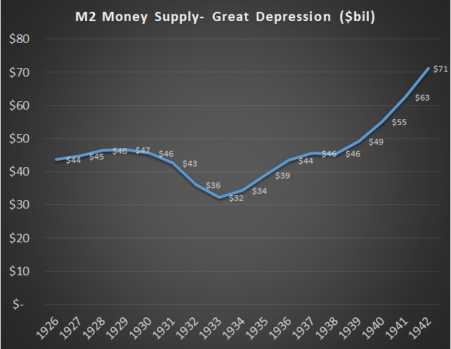
A significant amount of defaults and deleveraging occurred through the whole period from 1930 through 1933, and that in part led to GDP contracting, so debt as a percentage of GDP kept going up. In 1934, the dollar was devalued over 40% relative to its gold peg (from roughly 1/20th of an ounce to 1/35th of an ounce), and the government greatly expanded the monetary base (i.e. “printed money”) to fund all sorts of programs.
A big “deleveraging” occurred because all existing debts were essentially devalued relative to a much larger money supply and relative to the gold peg.
This policy naturally favored debtors over creditors, and turned a deflationary cycle (1930-1933) into a reflationary cycle (1934-onward). It also happened to boost the velocity of money, so nominal GDP went up as well. It was not without major drawbacks, especially for folks who were holding dollars or were creditors that were owed dollars, since the purchasing power of those dollars was diminished.
Total M2 money supply, after having collapsed during the default/deleveraging/deflation period from 1930-1933, quickly doubled over the next several years during the post-devaluation reflationary period:
We can look back into thousands of years of history, through American history, into longer European history, and then deep into ancient Roman and Greek and Mesopotamian history, to see that widespread long-term debt structural problems are often resolved with major currency devaluations and/or outright debt jubilees. Like it or not, that’s just how it goes.
Because the government can control money supply more directly than GDP, a useful ratio to be aware of is the total debt in the system divided by the broad money supply. In other words, how many dollars are promised to be paid in the future (i.e. debt) relative to how many dollars exist now? The higher that ratio, the wider Exter’s inverted pyramid is, at least in terms of that particular measure, which makes it more unsustainable and fragile.
I’ve been tinkering with that Bridgewater/Dalio chart above recently because I wanted a version with post-pandemic May 2020 numbers. Here’s my update and annotation:
Chart Source: Bridgewater Associates, Ray Dalio, Updated/Annotated by Lyn Alden
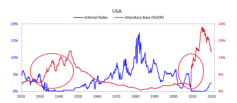
In many ways, the 2010’s were eerily similar to the 1930’s, and the 2020’s are shaping up to be eerily similar to the 1940’s, in terms of fiscal and monetary policy.
Modern Situation
Here’s the recent ratio of total debt to broad money supply over time, as of the end of 2019:
Chart Source: St. Louis Fed
The 1960’s and 1970’s were the low point on the long-term debt cycle, meaning that debt as a percentage of GDP (and as a percentage of money supply) were low. Specifically, the ratio of debt to broad money supply averaged about 2.5x for quite a while.
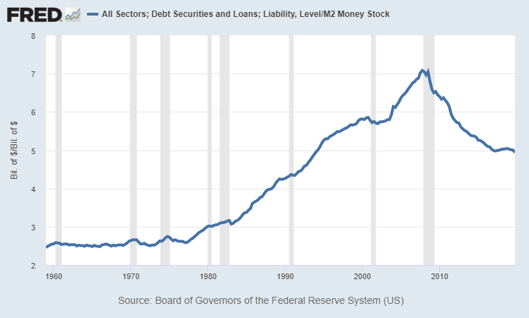
Starting from the late 1970’s, debt as a percentage of GDP and money supply began accumulating (which not coincidentally, also involved a secular bull market in equities). Debt as a percentage of money supply peaked in 2007 at a ratio of over 7x.
During the crisis of 2008, absolute debt was over $54 trillion and never went down from that point; it trended sideways for a couple years as the private sector deleveraged a bit and the federal government took on a lot more debt, and then total debt started accumulating again. However, money supply grew faster than debt from 2008 and onward, so the debt-to-money-supply ratio went from as high as 7x in 2007 down to only 5x at the end of 2019. This chart shows total debt (blue line) and broad money supply (red line) separately in nominal terms:
Chart Source: St. Louis Fed
In the coming several years, we should expect the ratio of total debt as a percentage of money supply to continue to move closer to 3x or below, and this pandemic recession will accelerate another leg lower. This is in part due to debt monetization; a significant portion of new debt, especially federal debt, is funded by new dollar creation from the Federal Reserve (QE), rather than extracted from actual lenders in the economy as it was prior to 2008. In other words, money supply will likely continue growing faster than total debt in percent terms.
For reference purposes, at the current amount of $75 trillion in total U.S. debt, a 3x ratio or below would be $25 trillion or more in broad money supply. If total debt goes up to $90 trillion in several years, a 3x ratio or less would mean $30 trillion or more in money supply. The current money supply in May 2020 is a little over $18 trillion.
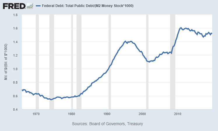
If we specifically look at the ratio of U.S. federal debt to the broad money supply (rather than total debt to the broad money supply), it looks like this:
This ratio was under 0.75 for much of the 1960’s, 1970’s, and 1980’s, but for a while now has been over 1.50, or about twice as high. Because debt moves up to the sovereign level as crises unfold, this ratio is harder to get down without a combination of higher inflation and yield curve control, which are both currently Federal Reserve targets to accomplish according to FOMC meeting minutes and Federal Reserve official inflation targets.
Post-Virus
In response to the economic shutdown that occurred due to COVID-19, fiscal and monetary authorities in the United States and much of the rest of the world spent and printed a lot of money to offset the big deflationary shock and GDP contraction that is occurring. The total U.S. response (fiscal spending plus central bank money-printing) was larger relative to GDP than most other countries so far.
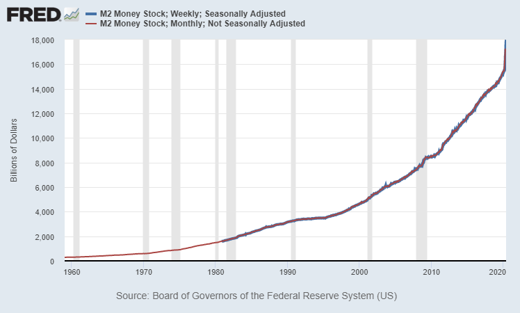
As GDP went down, the U.S. money supply went vertically upward. Money supply started this year at $15.3 trillion and went to over $18 trillion by late May.
Chart Source: St. Louis Fed
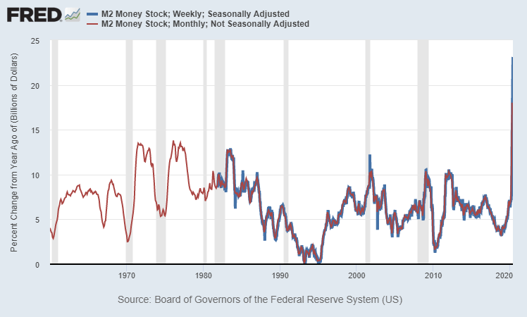
In year-over-year percent change terms, the growth in broad money supply is growing at the fastest rate in modern history:
Chart Source: St. Louis Fed
So, we’re already seeing a narrowing of the pyramid in terms of debt-to-cash, with broad money supply most likely rising as fast as total debt added to the system, which drives the ratio lower.
For example, if total debt has jumped from $75 trillion at the end of 2019 to $79 trillion in mid-2020 (mostly from federal debt increases), and we know that money supply is now over $18 trillion, then the ratio has already narrowed to about 4.4x as of May 2020, from 5.0x at the start of the year.
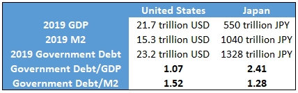
United States vs Japan
Japan often gets singled out as having the most debt relative to the size of its economy. However, although Japan has the highest total debt-to-GDP ratio in the world, the United States has a higher total debt-to-money-supply ratio.
As of the end of 2019, the U.S. broad money supply was only about 0.7x of U.S. GDP ($15.3 trillion in broad money supply vs $21.7 trillion in GDP). For Japan, that ratio was more like 1.9x (just over 1 quadrillion yen in broad money supply and 550 trillion yen in GDP). In Japan, the money supply is far larger and money velocity is far lower.
If we look at government debt, which is the easiest to calculate and display, although Japan has a higher amount of government debt as a percentage of GDP, they actually have a lower percentage of government debt relative to money supply than the United States:
The same holds true for a total public+private debt calculation as well. Japan has more total debt relative to GDP than the United States, while the United States has more total debt relative to the money supply than Japan.
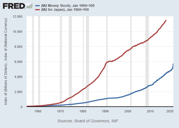
If we chart the money supply of Japan and the United States from the beginning of the data set from 1960 and onward, normalized to 100 in 1960, we can see that Japan’s money supply grew far faster than the money supply of the United States over the long run.
Chart Source: St. Louis Fed
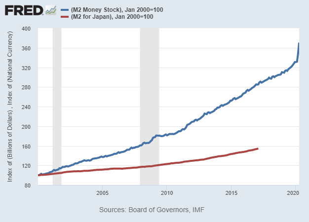
However, if we normalize it to 100 in the year 2000 and chart from there, the United States’ money supply has been growing much more quickly than Japan’s money supply in recent decades:
Chart Source: St. Louis Fed
The same is true if your normalize it to 1990 or 2010, and even if you adjust it for differences in population growth as well. In these more recent decades, US money supply has been growing much faster in percentage terms than Japanese money supply from its existing level. This particular data set charted by the St. Louis Fed ends in 2017 but more recent data from other sources shows that this remains the case into the 2018-2020 period. The United States has been “catching up” to Japan in terms of increasing the total money supply and reducing the velocity of that money supply.
Over the past decade, this is true for the U.S. money supply vs the Eurozone money supply as well, meaning that U.S. money supply has been growing more rapidly from the starting baseline.
In my view, when it comes to currency analysis, too many analysts focus heavily on past monetary expansion (e.g. “Japan has printed a lot more money than the U.S.”), and don’t focus enough on the rate of change of current and future monetary expansion (e.g. “the U.S. is now printing money at a more rapid pace than Japan, and has been for a while”).
Final Thoughts
The ending of the previous long-term cycle and major economic depression in the United States had two phases: one for the 1930’s and one for the 1940’s.
After the 1929 peak, a recession and major asset price collapse began. In the 1930’s, total debt as a percentage of GDP peaked, but it was primarily a private debt bubble. Federal debt as a percentage of GDP was pretty low, while private debt was extremely high. This massive crisis and deleveraging event resulted in a bank crisis and the biggest economic contraction in U.S. history. Money was printed and currency was devalued, but due to the major destruction in other net worth, it was not a very inflationary event. The first few years were outright deflationary, and then the money-printing turned it into a mildly reflationary environment, but the overall decade saw low inflation or disinflation.
1940’s: Federal Debt Bubble, Wartime Finance, Inflation
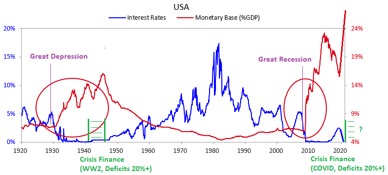
In the 1940’s, private debt had gone down considerably as a percentage of GDP due to all of this deleveraging and expansion of the money supply, but due to World War II, federal debt as a percentage of GDP skyrocketed. This era of wartime finance was inflationary due to massive spending and industrialization, with peak federal deficits exceeding 30% of GDP. However, the Federal Reserve used yield curve control (which was basically quantitative easing; creating dollars to buy Treasuries as needed) to peg Treasury bond yields to 2.5% or below despite higher inflation. Therefore, Treasuries significantly under-performed inflation for the decade and the government effectively inflated away its excess debt.
So far, we have an echo happening in the 2010’s and 2020’s.
After the 2007 peak, a recession and major asset price collapse began. Total debt as a percentage of GDP peaked in 2008, but it was primarily a private debt bubble. Federal debt as a percentage of GDP was moderate (about 65%) at the start of the crisis, but quickly grew to over 100% in the subsequent years as the private debt bubble was mainly pushed up to the sovereign level. The massive deleveraging resulted in a bank crisis and the biggest economic contraction since the Great Depression. Money was printed via quantitative easing, but due to the major destruction in other net worth and several deflationary forces, it was still a disinflationary environment rather than inflationary environment, outside of certain key areas such as healthcare.
2020’s: Federal Debt Bubble, Pandemic Finance, Inflation?
In the 2020’s, private debt has gone flat for a while as a percentage of GDP (household debt is down while corporate debt is up), but federal debt began skyrocketing from an already high 106% of GDP baseline level in early 2020 due to the pandemic and subsequent economic shutdown. Federal deficits of 20-30% of GDP in 2020 have approached World War II levels for the first time in modern history, resulting in federal debt levels rapidly moving to 120-130% of GDP and likely higher in the years ahead. The Federal Reserve began discussing yield curve control in 2019, bought a massive amount of Treasuries in mid-March when foreigners sold over $250 billion in Treasuries and yields briefly spiked, and in recent FOMC meeting minutes they discussed yield curve control via ongoing Treasury purchases.
In line with a reflationary or stagflationary outlook combined with yield curve control from the Federal Reserve, I continue to be long-term bullish on precious metals in this environment, with a particular emphasis on silver at the current time. For this decade I also like certain cheap value/cyclical/foreign sectors over expensive growth/defensive/tech sectors broadly (when carefully-selected, with strong balance sheets and high returns on capital).


