‘Historically’, it’s a big 12 letter word. It is used so often that it has become a string of empty platitude. History tells us figures and those figures tell us what would happen on a large scale and not vice versa. In recent times, ‘historically’ is used as a prefix comfortably to not the past events, but one’s experience of past events. Often in such representation does one forget and link theory to numbers, one interpret in a manner which feed to their thinking. Not denying one’s right to have an opinion but when there exists a big bag of mixed conflicting opinions, then you should sit, breathe and think, it is then when a ‘World out of Whack’ is born. This blog explores connection between multiple opinions and outliers which skew public’s ‘opinion’. This in part is addition to the belief underlining the previous blog ‘Capital Flow and Inverted Yield Curve’ that the frightening recession indication may be a false positive or a danger lurking in the shadow.
As Stan Druckenmiller say, “Looking at U.S. Treasury yield curve inversion – in isolation – relative to recession risk is a fool’s errand.” Alone, any asset is guest to multiple conjecture however, when a cross asset examination is made, figures alone tell a beautiful story. A story which many lived through but were wilfully blind to it as they were pretty occupied searching in numbers a story which they wanted to believe to be true.
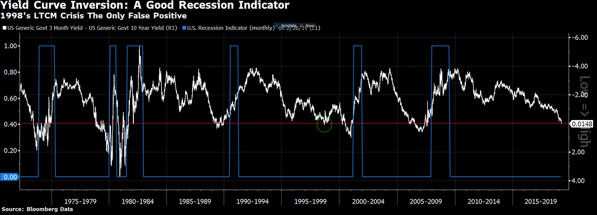
To begin, commonly 10 year Treasury yield (TNX) is most quoted as this is tied to a variety of assets, indexes and indicators in financial markets including 30 year fixed rate mortgage. Since 1990, 3 month/ 10 year yield curve has inverted thrice, 1998, 2000-2002 and 2006-2008. The first inversion lasted only for a few days (Greenspan Put) and is a classic example of a false positive. In response to inversion, S&P rallied rapidly and only a few were left to take advantage from it. In 2019, March GDP forecasts plunged lower to just above 1.5%. Treasuries have been pricing in GDP slowdown for a month now. The percent of S&P 500 stocks flashing a MACD sell signal in past 10 days hit about 52% on March 7, it is on this date that the 3 year treasury yield first inverted by dropping below 1 month Treasury yield .
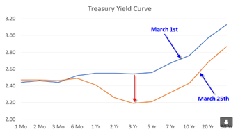
Source: Investopedia
On March 22, the 10 year treasury yield (TNX) dropped below 1 month treasury yield. 20 year and 30 year treasury yields are still above 1 month treasury yield. On average, it takes equities eight months to peak and drop lower once the yield curve inverts.
A conflicting opinion on the inversion is expressed by three individuals. A ‘perma-bear’ Albert Edward who has been underweight U.S. equities since 1999 says, “We currently have a dreaded yield curve inversion with 3 month rate exceeding 10 year treasury. This is a classic signal of coming recession. But recession does not start until the curve starts to steepen again with short term rates falling.”
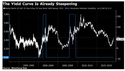
Bloomberg’s John Arthur points out that the steepening is underway and that the spread between 10 year and 30 year yields is rising fast. On Thursday, 10 year treasury yield rebounded from 15 month low.
This for-recession opinion stands tall with opposing false-recession opinion by Goldman and Morgan Stanley strategists. Goldman strategists led by Alessio Rizzi and Christian Muller – Glissman say, “The proportion of yield curve that’s inverted isn’t as high as in past recessions and part of slump can be attributed to dynamics outside U.S. American credit spreads also aren’t telegraphing stress.” At Morgan Stanley strategist Matthew Hornbach thinks “The 3 month 10 year inversion would need to continue at least until June Federal Reserve Policy meeting before policy makers get uncomfortable.”
A moot point.
As Investopedia explains, when investors get nervous about economic outlook, they tend to buy long term treasuries to protect their capital which basic economics tells us increases demand for long term treasuries, causing higher prices and lower yields. They may even buy longer term treasuries with lower yields than short term to lock in the yield anticipating that Federal Reserve would be forced to lower short term rates to prevent economic slowdown. Panic buying pressure had pushed 10 year yield (15 month low) and 3 month T – bill yield to 2.40%.
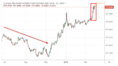
Even though short end of the yield curve is currently higher than the belly of the curve, traders have already priced in the Federal fund rate cut by FOMC in 2019 by rising the prices of futures contracts up.
Now let’s see how S&P 500 is performing. On Thursday, Bloomberg cited that S&P 500 index remained on its track for its best quarter since 2009 with the beaten down, commodity and financial shares leading the charge. In order to not miss the apparent last leg of rally before the fall, investors are lifting S&P higher which is clouding the voice of the market. Investors are so confident about its movement that they continue buying on margin.
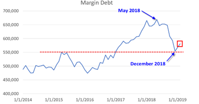
Margin debt which reached an all-time high in May’18 with hitting bottom in Dec’18 have rebounded substantially and few inches away from meeting its 2018 high. The economically sensitive sectors such as banks, fell sharply along with bond yields. Banking shares fall when curve is inverted as the there is a squeeze in interest margin for borrowing short and lending long.
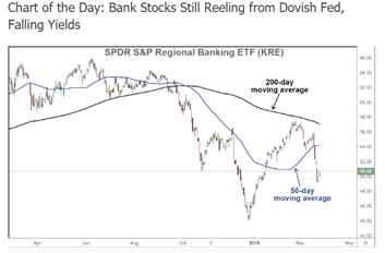
Let’s narrow into the equities and look at sectors. When the yield curve made its inversion, financials, banks, energy, oil, semiconductors and FANGs fell. However, there were two sectors which gave a positive return despite market dip, utilities (XLU) and staples (XLP). We now zero in further and analyse two sectors in particular: Staples (XLP) – defensive sector and consumer discretionary (XLY) – cyclical sector. This is an insight provided by Bear Traps Report in its public blog.
For five years before June 2018, XLY outperformed XLP by 82.6% vs. 47.90%. Since June 2018, XLP has outperformed XLY. This trend of before and after June 2018 repeated itself transparently in past 30 years whenever U.S. saw recession. XLP apparently is a recession proof sector!
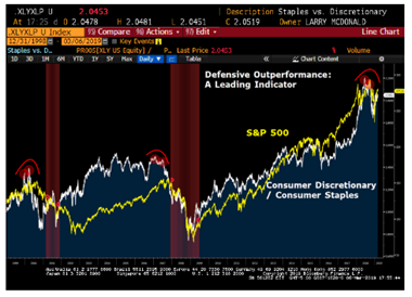
Source:https://www.thebeartrapsreport.com/blog/2019/03/22/classic-signals-fixed-income-and-equities/
When XLP is compared with S&P 500, XLP did outperform SPY by 24.53% in 2000 – 2002 and by 27.60% in 2006 – 2008. However, we earlier noted that equities take 8 months to drop upon yield curve inversion. XLP outperformance also started after 12 months in the yield curve inversion.
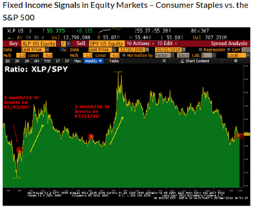
Source:https://www.thebeartrapsreport.com/blog/2019/03/22/classic-signals-fixed-income-and-equities/
Such confirmations are evident in close dissections and hide behind numbers in plain sight signalling when to be overweight or underweight and in which sector. It is on such occasions when one should read the numbers rather than reading theory and fitting them with numbers. Like in regression, even the best fitted line leave residuals.
It would be too soon to draw conclusions where the economy is headed as a lot depends on Federal Reserve but you can always be prepared for either occurrence if you choose to invest time in independent unbiased research without following the crowd and allocating your money wisely so that when the crowd grasps the trend in a sector and rush to get in, then you can get out and reap fruits of your selection.
(with inputs from Apra Sharma)


